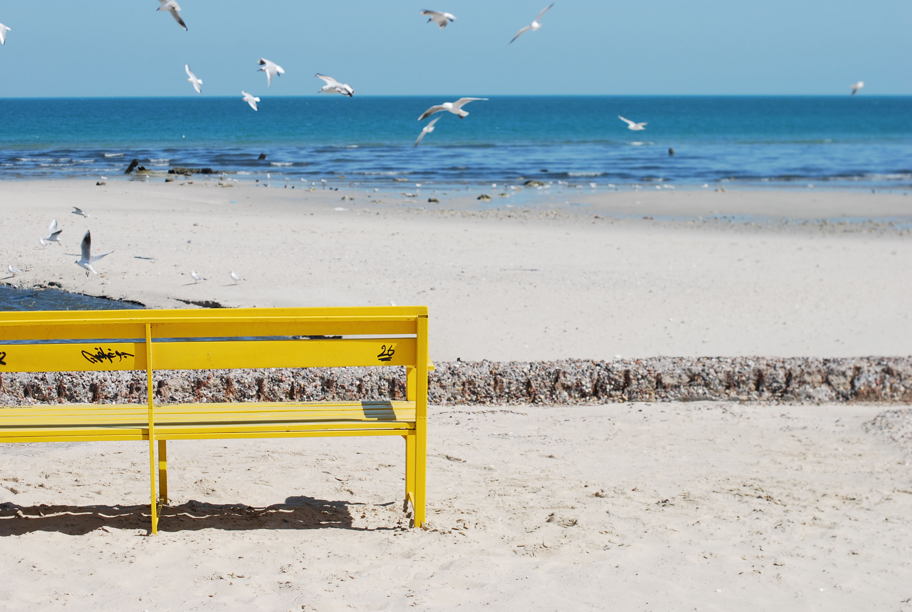
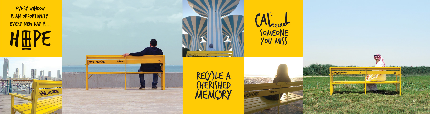
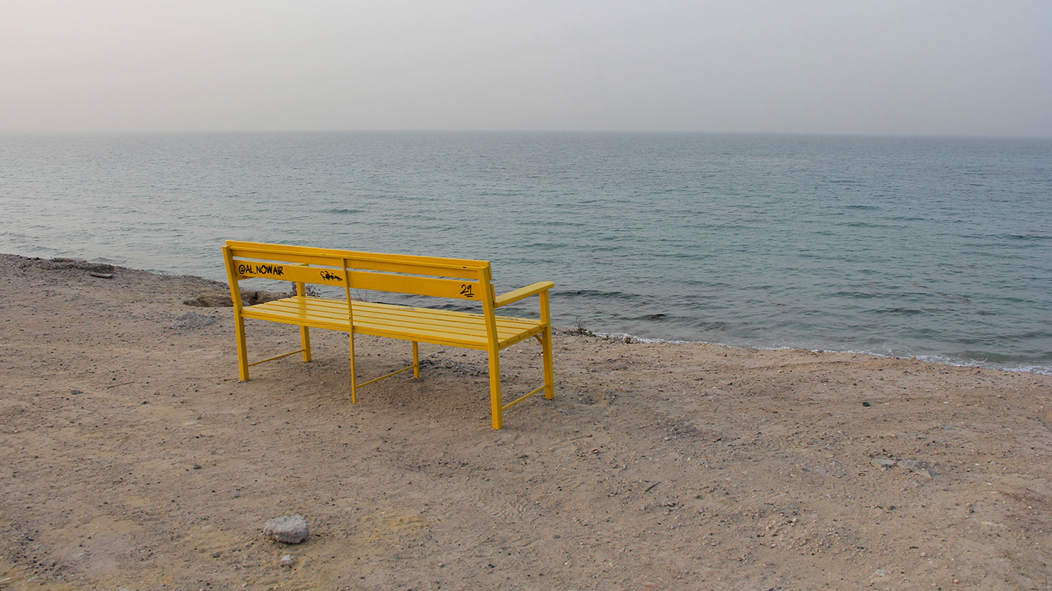
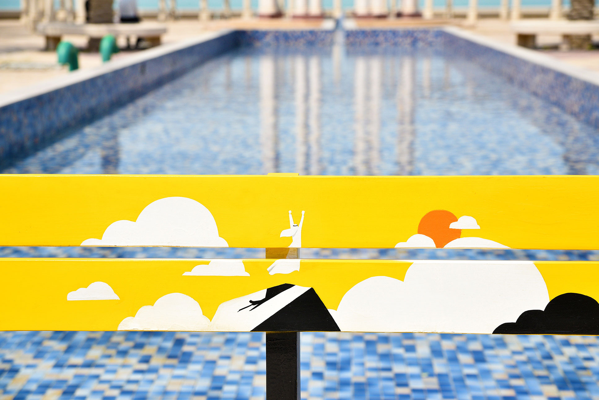
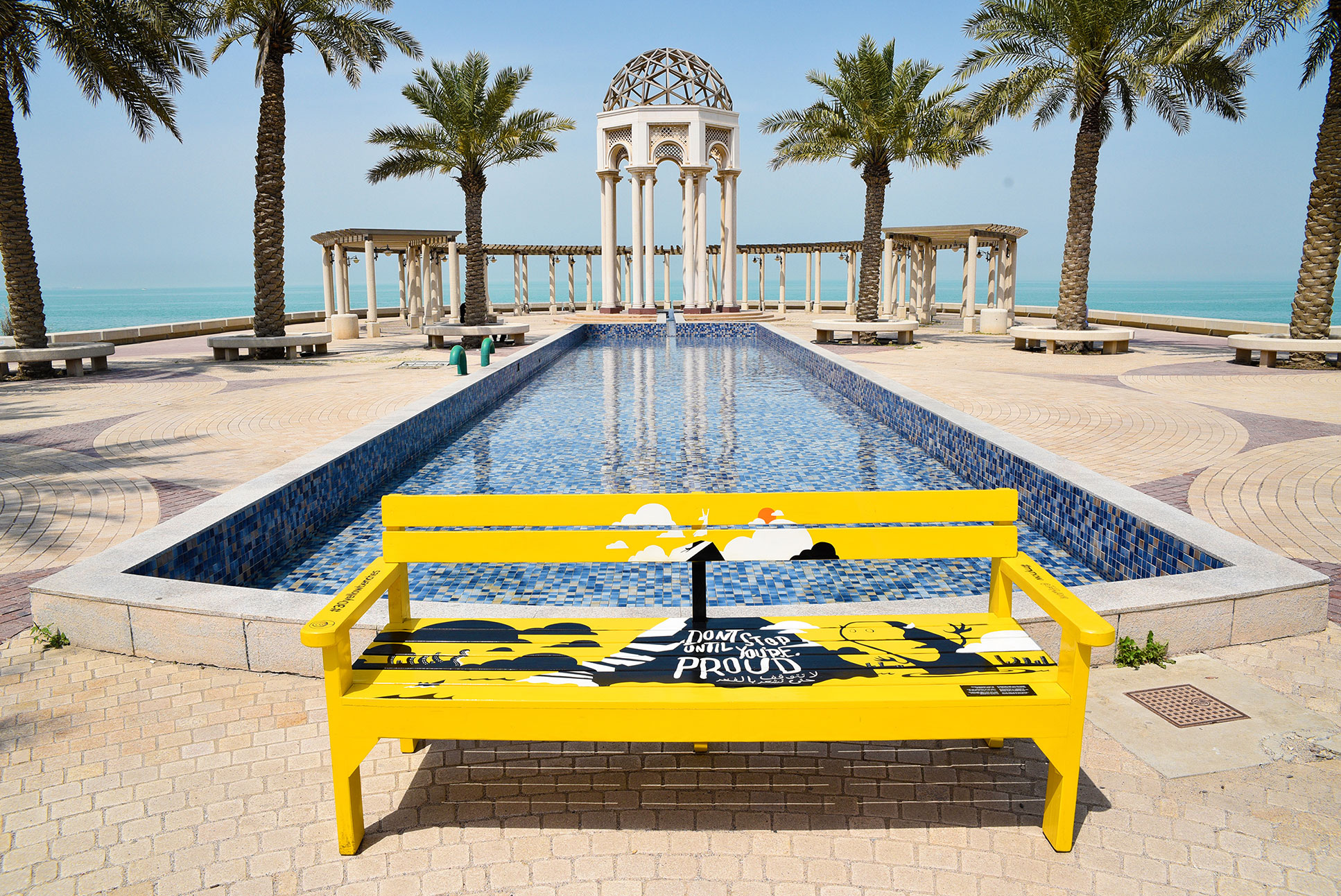
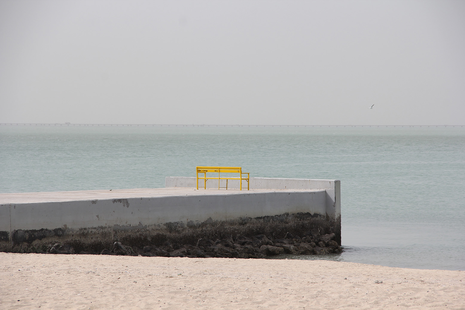
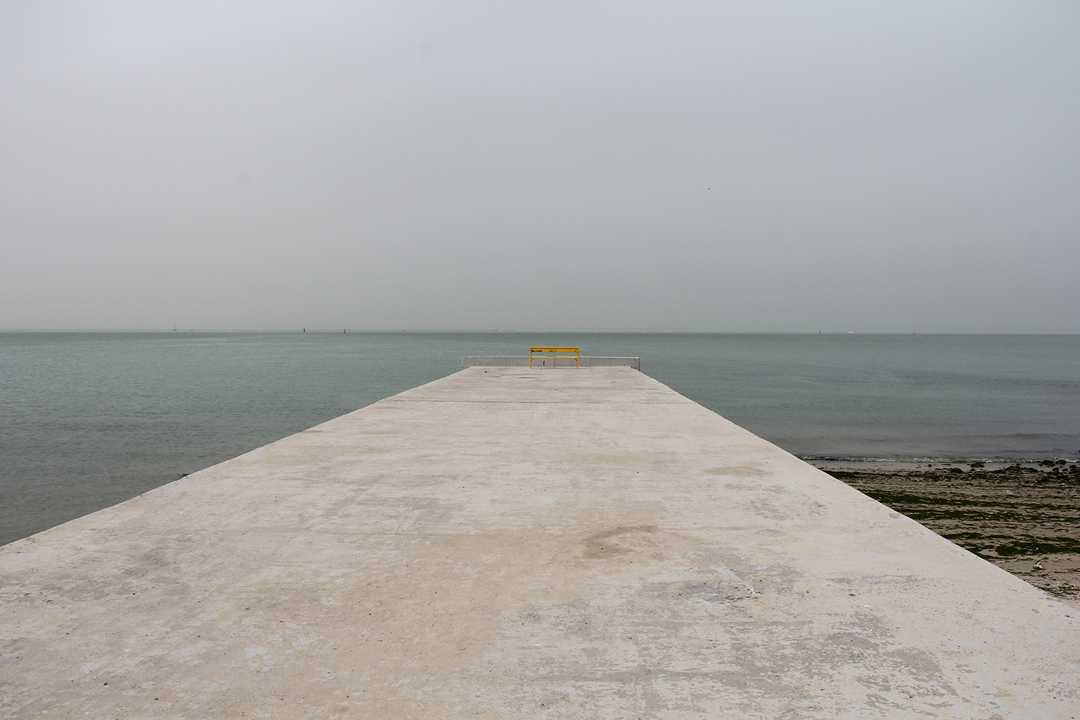
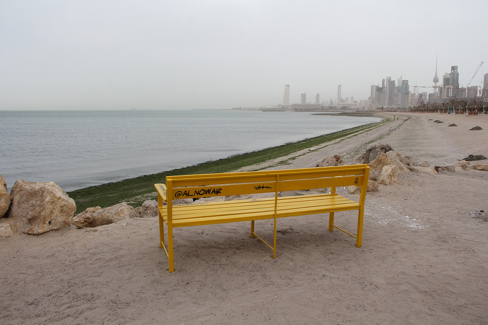
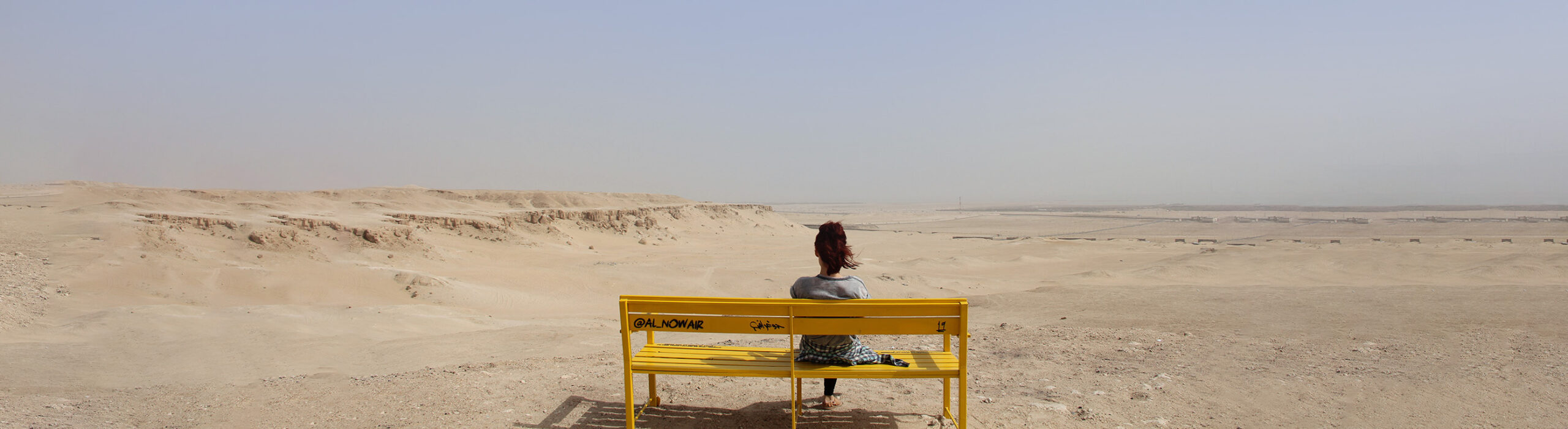
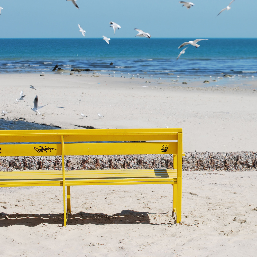
All Posts By

admin

30 Yellow Benches-Old

30 Yellow Benches

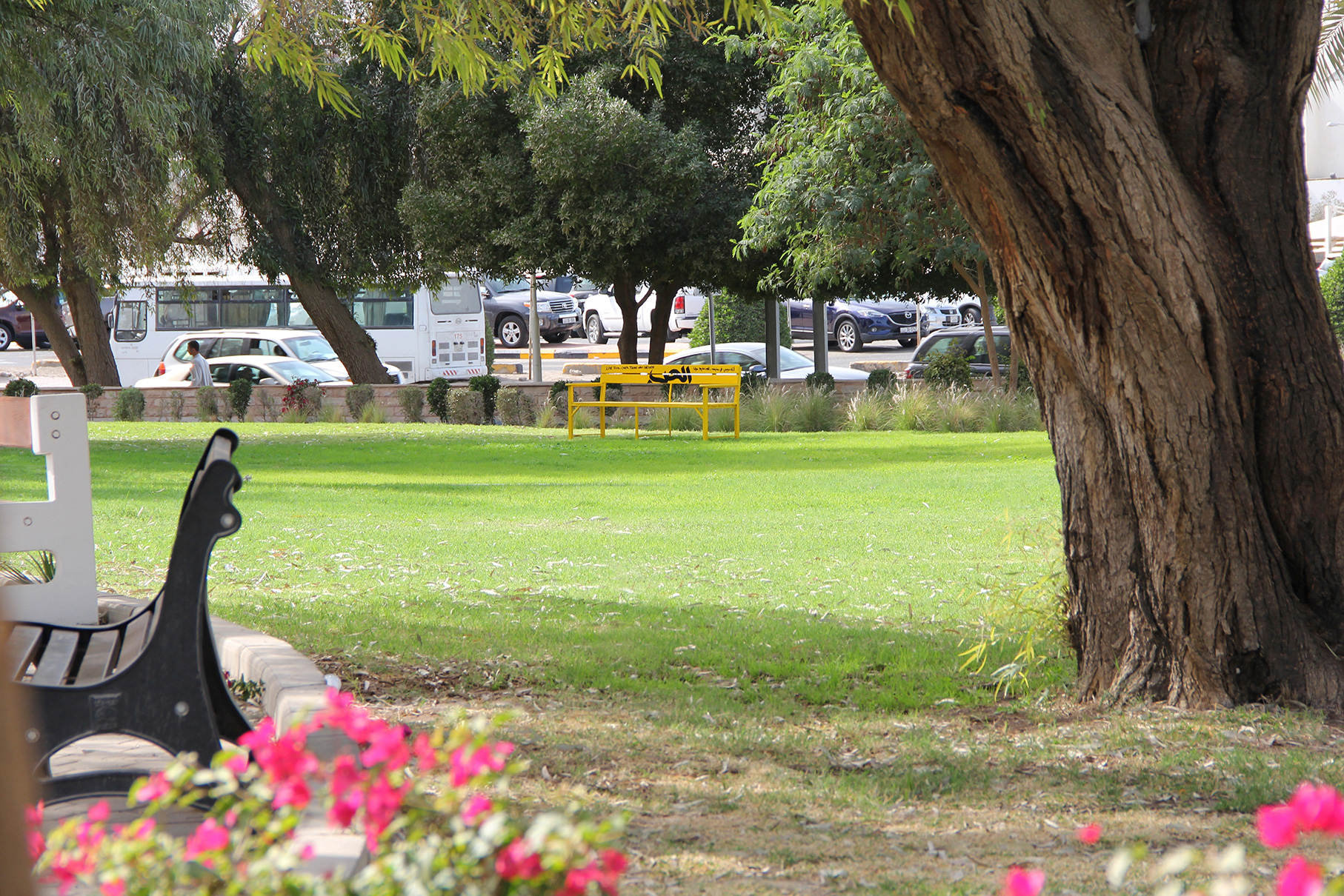
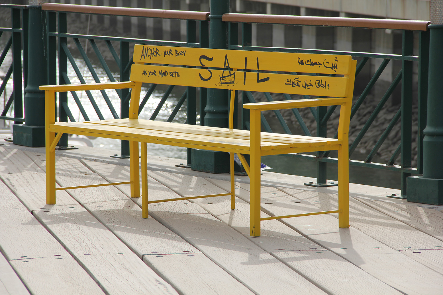
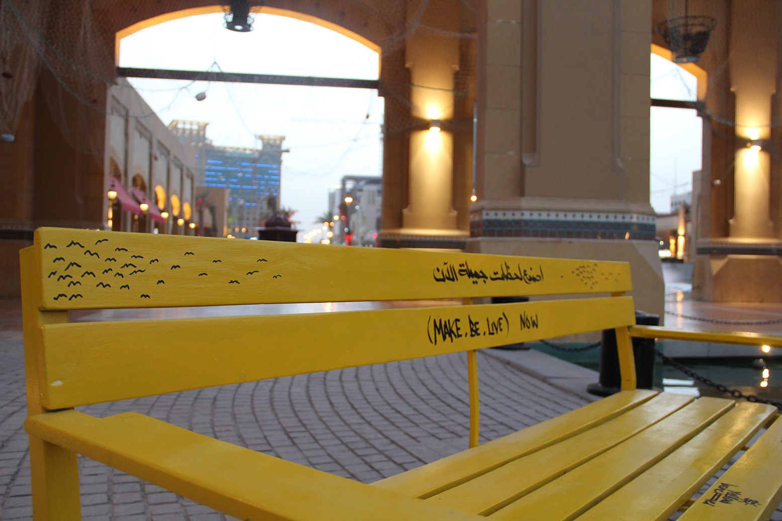
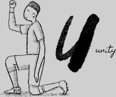
We travel around the world to look for beauty but often neglect what is around us. We wanted the people of Kuwait to notice and appreciate its beauty.

With that in mind, we placed 30 yellow benches, with 30 hand-painted messages/ artworks, all the way from the outskirts to the heart of the country.

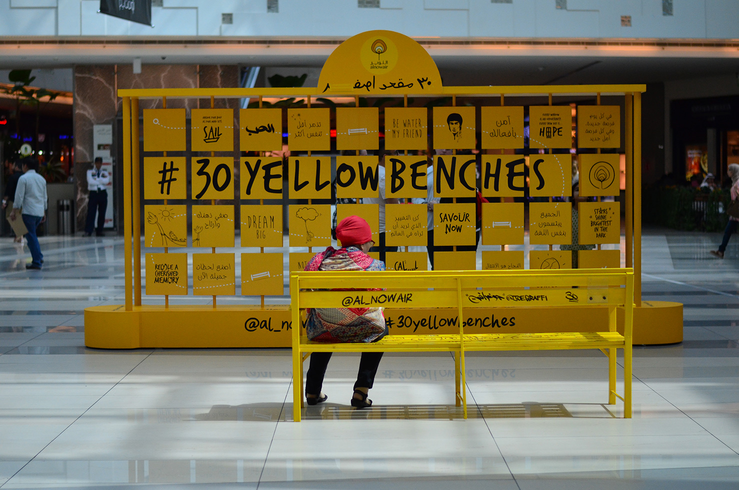
This was followed by a challenge to find all 30 benches with the help of a map on Alnowair’s website and an installation in Kuwait’s largest mall to spread awareness about the campaign.

@al_nowair with Head of Alnowair Gaja Kruchlik, Communication Strategist Wasim Khan, Project Coordinator Maryam Al Helal, PR Specialist Ahmed Younis, Senior Graphic Designers Vanig Kodjian, Malak Sahli, Predrag Nikolic, Production Manager Jad Sharara, and Calligraffiti Artist @joegraffi

30YellowBenches (12)
30YellowBenches (11)
30YellowBenches (10)
30YellowBenches (9)
30YellowBenches (8)
30YellowBenches (6)
30YellowBenches (5)
30YellowBenches (4)
30YellowBenches (3)
30YellowBenches (2)
30YellowBenches-TheAvenues (5)
30YellowBenches-TheAvenues (16)
30YellowBenches-TheAvenues (3)
30YellowBenches-TheAvenues (11)
30YellowBenches-TheAvenues (13)
30YellowBenches-TheAvenues (14)
30YellowBenches-TheAvenues (4)
30YellowBenches-TheAvenues (15)
30YellowBenches-TheAvenues (7)
30YellowBenches-TheAvenues (8)
30YellowBenches-TheAvenues (9)
30YellowBenches-TheAvenues (10)
30YellowBenches-TheAvenues (12)
30YellowBenches-TheAvenues (1)
previous arrow
next arrow

To My Beloved Sister-Old

To My Beloved Sister

Intisar Foundation and Alnowair compiled a book of letters from and to women affected by war to inspire them and give them more strength. It also includes exercises based on positive psychology and drama therapy to help them deal with trauma.

Illustration
Layout & Book Design

The book cover resembles a closed envelope (a printed image of an envelope).
It embodies the title – A book, which is not only a book, but a letter, written with love.

The back cover looks like the other side of the envelope

A hand-written font is used with the text “Address: From my heart to yours… always”.
The top-right corner has the image of stamps from Kuwait to further imprint the idea of it being a letter.

Letter to myself

A real envelope is stuck to the inner side of the cover which reads “A letter to myself”. The keeper of the book could write one, fold it and keep it with them, in this book they carry.

Table of Contents

The Alnowair and Drama Therapy exercises are marked with a light yellow and light pink highlight (derived from the brand colours), respectively. These are also be the colours of those pages, making them easy to find in the book.

Page colours

The Alnowair exercises are on yellow pages
Drama therapy exercises on pink pages
The letters & notes on white pages

Illustrations & Design Elements

Only the exercise pages have simple pencil-line-drawings on them.
This will encourage the book keepers to doodle/ draw and make the book their own.

A cut-paste design element is used to make the book feel like it is a collection of memories and thoughts.
The book keepers could also stick photos, drawings, newspaper/ magazine clippings etc to add a personal touch to their books.

There’s always a comfortable amount of space for book keepers to write and complete the exercises.

Boomerang-TOT-Old

Boomerang

Workshop Manual for Teachers

Alnowair pioneered a unique anti-bullying campaign, spreading the word to teachers and children alike. Words were put to action with expert assistance, via the medium of Applied Theatre using Drama Therapy. The campaign was diligently carried to schools across Kuwait, reaching vast and varied populations of students and teachers.
Over 50 illustrations created, were at the heart of developing inviting, engaging and informative manuals. The enjoyable challenge here was not only understanding exercises to provide visually stimulating representations of them, but to create an overall feel for the manual that evoked the curiosity to experiment and engage with this ‘new way’. While the message was significant and mature, the tone of the design was warm and relatable.

Illustration
Layout & Book Design

@al_nowair
with Program Development Dierctor Angelique Bhattacharjie

Introduce Me

A work-in-pairs exercise where students get to know each other and realise they have shared interests

Walk of Words (Cat)

Reflection Circle

Step Inside If…

Students take steps forward toward a circle IF they agree with certain statements. They move back two steps after each statement, if they don’t

Taking Sides

An exercise helping students understand what they have in common with each other

Image Theater
Emotional Expression

Students express a selected word through body language, facial expressions and positioning

Behind My Back

Students indulge in positive gossip about a classmate who stands with his back facing the group

Jumping Star

Run and jump like a star!

Body Awareness

A group exercise that invites students to tap into their body awareness, build concentration, focus and self-awareness

Exploring Emotions

Encouraging students to examine and explore what emotions mean to them, and how they represent emotions through facial expressions and voice

Criticisms

Learning associated feelings and emotions related to receiving and expressing negative communication

Compassion Circle

A group bonding exercise to reassure students that they share a space that is safe, caring, respectful of each other and forgiving

Compliments

An exercise where students learn the associated feelings and emotions related to receiving and expressing positive communication

Shake It Out

Releasing any residual energy from previous exercises :)

Mirror, Mirror

A work-in-pairs exercise where students learn to observe, lead and follow

Compassion Circle

Bunny Bunny

A fun group exercise to release any residual energy from the previous exercises

Bullying Chain

Students take turns to role-play bullying characters, to allow a deeper understanding of the dis-empowering emotions and consequences of bullying

Kindness Chain

Students take turns to role-play kind characters, to allow a deeper understanding of the empowering emotions and positive results of choosing to be kind

Freeze Your Feelings

Cast-hopping

Students choose different characters that they would like to play during different rehearsal rounds of the play

Final Casting

Hot-seat

Students take turns to role-play characters of bullies and victims, while being interrogated by their peers to better understand the motives, causes and consequences of their behaviour

Breathing

I love me…

A group exercise aimed at enabling students to build greater appreciation and gratitude for themselves and their skills & strengths

Walk in Character

An energiser for students to prepare for rehearsals, by embodying the full persona of their play characters

Filling up individual workshop logs, followed by sharing thoughts

We can do it!

An exercise for students to express shared emotions, thoughts and concerns about the upcoming play, as well as offer encouragement

Walk your Lines

This group exercise challenges students to strengthen their focus, concentration and memory skills

Final rehearsals on school stage

QGO-Old

QGO

One of the wings of Boodai Aviation, QGO is an easy and hassle-free Online Travel Agent offering the best valued deals for accommodation, hotel chains, tour operators, transfer companies and much more.

A delicious logo & user-friendly website concept was presented. Although it made us @yellowsubmarine.me want to click and go, it didn’t quite fly with the client.

Logo Re-design (Pitch)
Website Re-design (Pitch)

Shergarh-Old

Shergarh

Shergarh is a peaceful jungle abode nestled around a spring-fed lake on the edge of Kanha Tiger Reserve. With just six cosy tents, delicious home-cooked food, excellent naturalists and a fabulous local team, it is the perfect place to unwind in nature’s bounty. The overall identity, especially the website, had to encompass this beauty and let visitors experience a bit of the magic to convince them to travel all the way to the camp.

Revised Brand Identity
Marketing Tools
Website Design

After two weeks of extensive study, several photographs of the location, lamps, old telephones, letters, paw prints from a tiger trail, scanned leaves and much more were used as elements for the designs. For instance, real-time captures of actual mud-prints retrieved from Shergarh were used as part of the website’s background.

Intisar Foundation-Old

Intisar Foundation

Intisar Foundation works with women affected by war trauma through drama therapy – A healing combination of theatre and psychology.
Empowering and uplifting them to be able to voice their power and take lead on their own lives, their families, their communities, and eventually the Arab world at large.

Re-branding
Logo Design
@yellowsubmarine.me
with Senior Graphic Designer Vanig Kodjian and Captain Gaja Kruchlik

Slogan/ Copy-writing
Pattern Design
Brand Guidelines

Motion graphics by Predrag Nikolic

Intisar Foundations’ new logo symbolises the journey of a woman affected by war through the use of Drama Therapy that liberates her mind and releases unresolved emotions. It entails the story of change, showing how a woman in despair morphs to a woman rebuilt, self-assured and victorious (Intisar in Arabic means “Victory”).

This transformation showcases her victory over her trauma. The triumph of hope & peace over helplessness and hardship.

– To take action
– To perform

for

– A world without war, oppression and inequality
– Tranquility within oneself – Inner peace

Intisar Foundation understands, respects and upholds the importance of the individual as well as the collective. The pattern represents that ideology. it symbolises the strength of #1MillionArabWomen

Corona Awareness Posts-Old

COVID-19 Awareness Posts

The impact of COVID-19 is being felt around the world. At Alnowair, we made a series of posts spreading awareness and illustrating necessary steps to keep ourselves and our loved ones safe and supported.

Content idea inspired by the Instagram posts originally created by Wei Man Kow

3D Characters & Objects
Designed on Blender

Dawat Restaurant-Old

Dawat Restaurant

Dawat is one of Kuwait’s oldest, most popular restaurants serving Indian cuisine. With rising competition and a change in customers’ taste, a new direction was needed.

A revitalised logo was suggested as the first step forward.
Sadly, the owners changed their minds and decided against altering the brand’s known identity.

Logo Re-design (Pitch)
Custom Font Design

The “द” with a peacock (a symbol carried from the existing logo to maintain an element of continuity) in the negative space immediately creates an association with India.

This is solidified by using rich Hindustani colours that remind the viewer of delicious food cooked in rich spices (Mirch Red and Haldi Yellow).

The font preserves the Indian feel of the Devanagari script, but is bold and clear, complementing the logo.
Corresponding custom Arabic lettering fits in harmoniously.

The new logo clearly stands out and stands strong, not only in comparison to the previous one but distinctly among competitors as well.

Beauty & The Beast Prologue-Old

Beauty & The Beast

SIK (Staged In Kuwait) Productions is a community theatre group with a long history of successful productions in Kuwait.  The non-profit organisation that brings together volunteers of all nationalities and professions has hosted five sell-out shows of the beloved tale as old as time – Beauty & the Beast. A competition was organised to illustrate the famous prologue.

This, I can proudly say, was the winning entry :)

Illusrtation
Animation

Voice-over and music are the property of Walt Disney Studios

A-Z of Positivity (Gratitude Font)-Old

A-Z of Positivity

The COVID-19 pandemic has been an unprecedented challenge for the world. It has also been a learning experience. Four months in, the teams at Alnowair, Yellow Submarine, Bareec and Lulua Publishing shared things they were grateful for during the lock-down.

A poster was designed and put up in the offices as a reminder.
Inspired by Oliver Jeffers’ alphabets, a custom, hand-made font titled “Gratitude” was created.

Font Design
Poster Design
Illustration