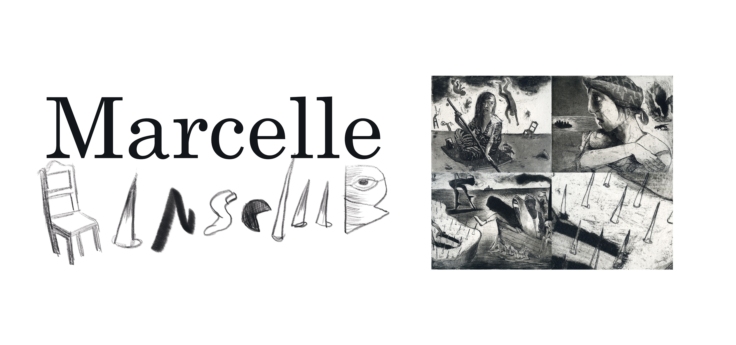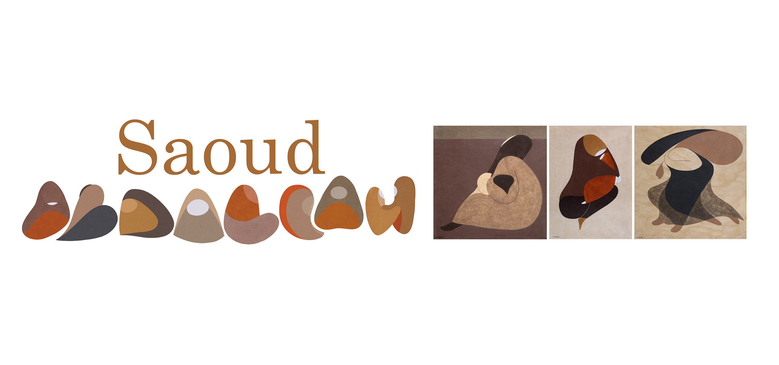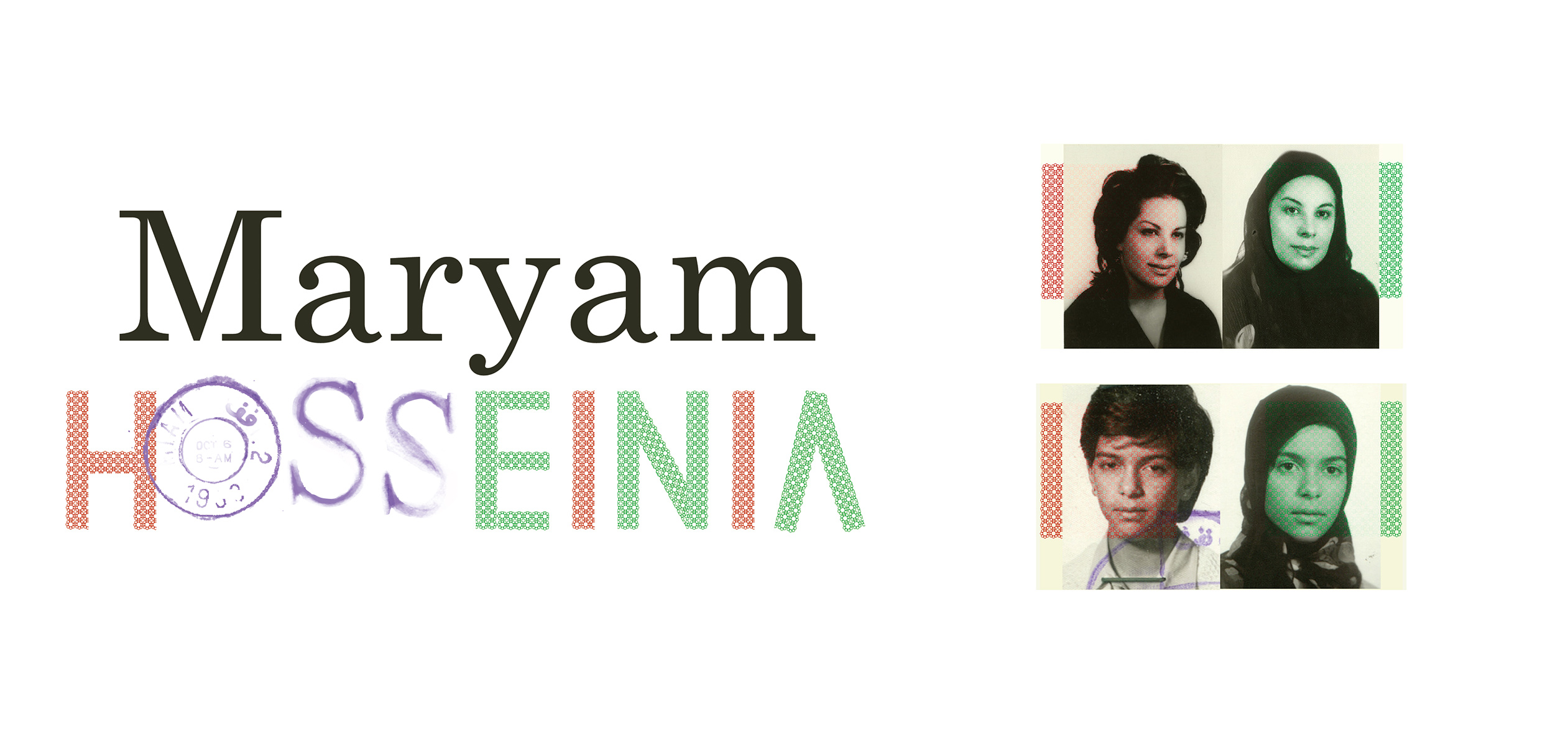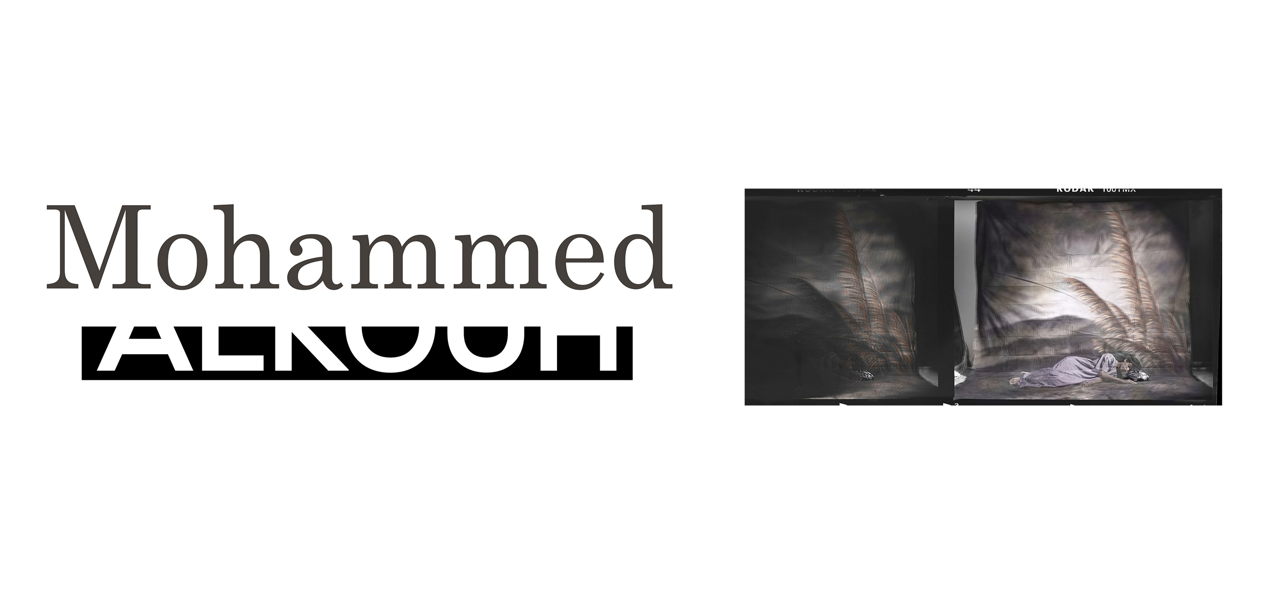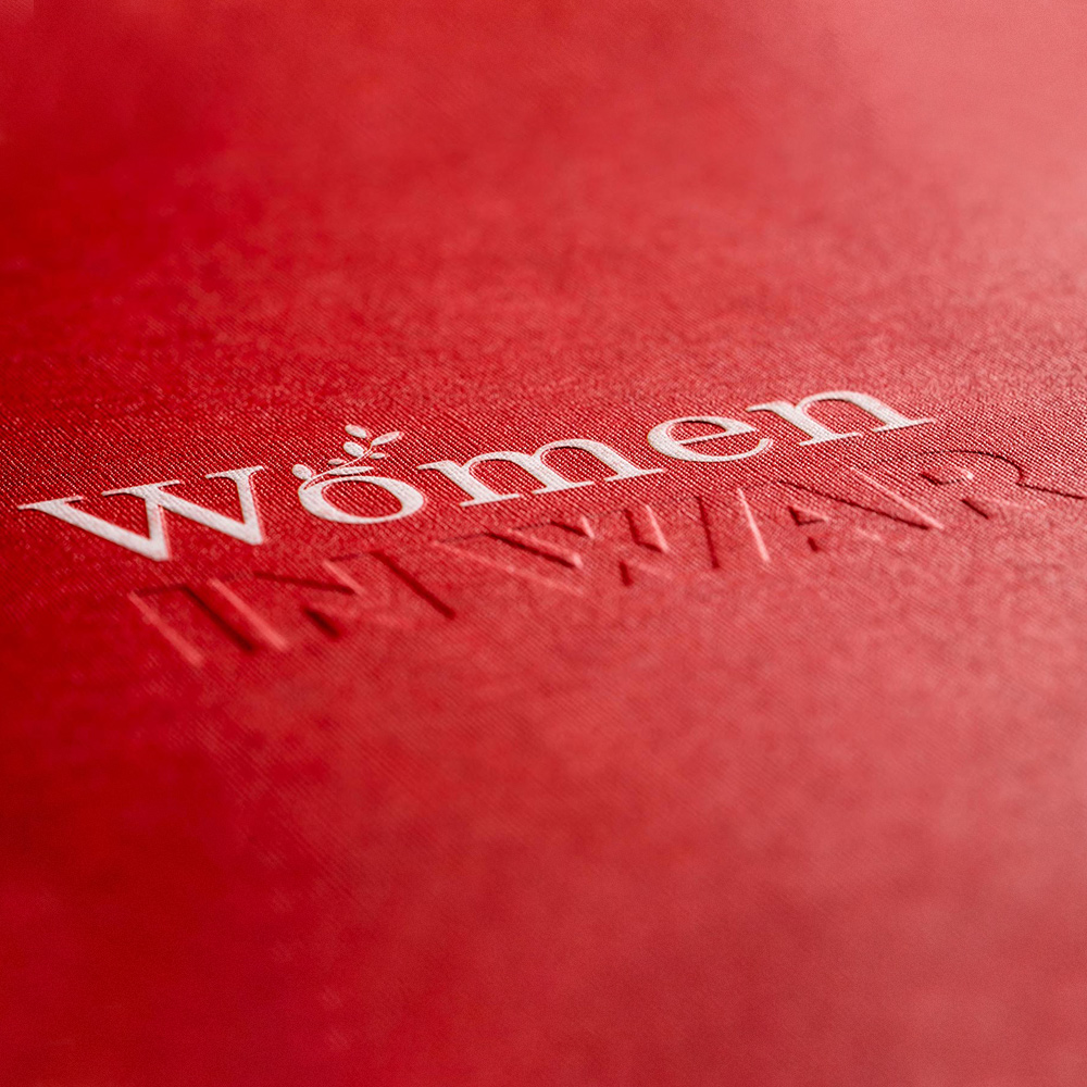
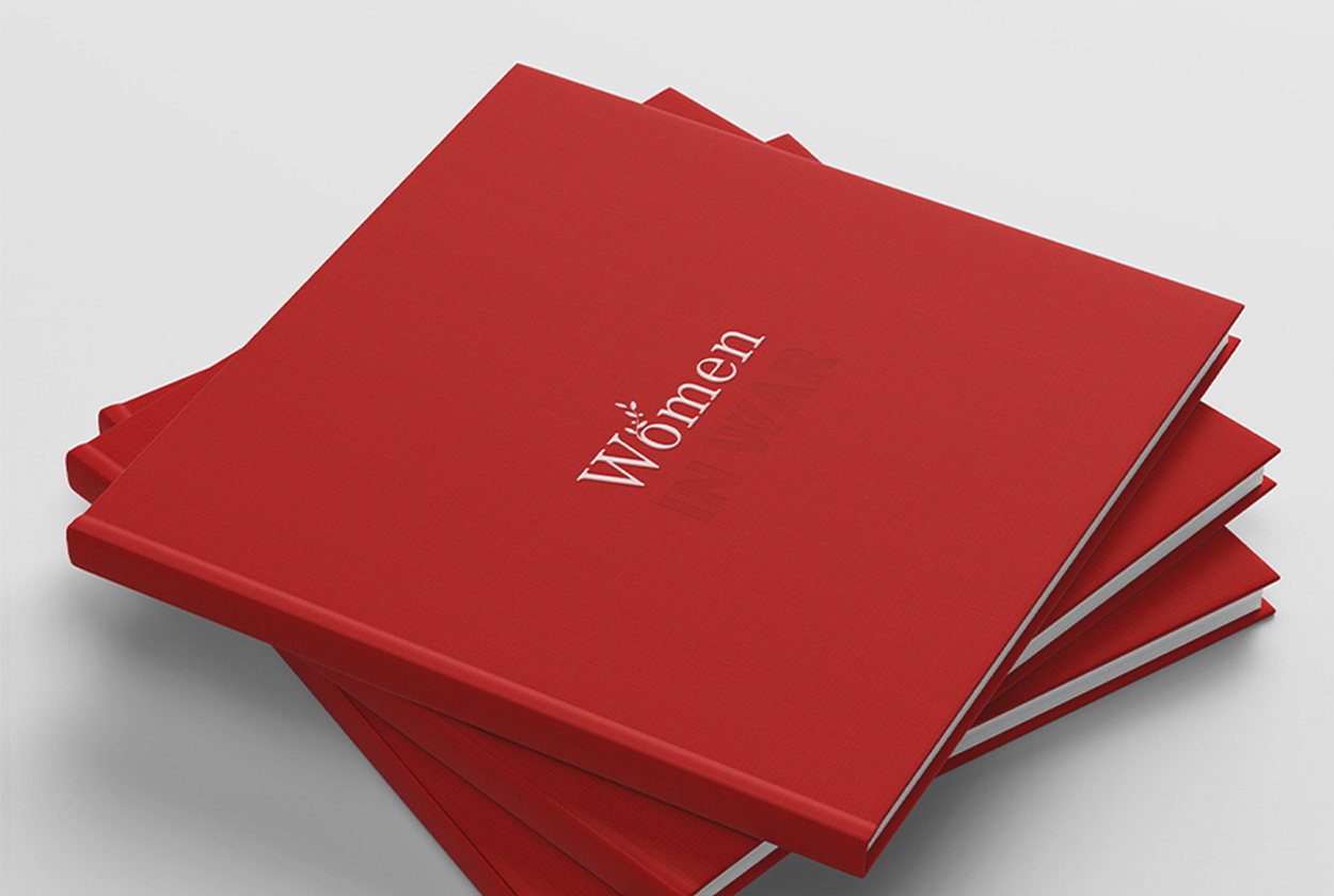
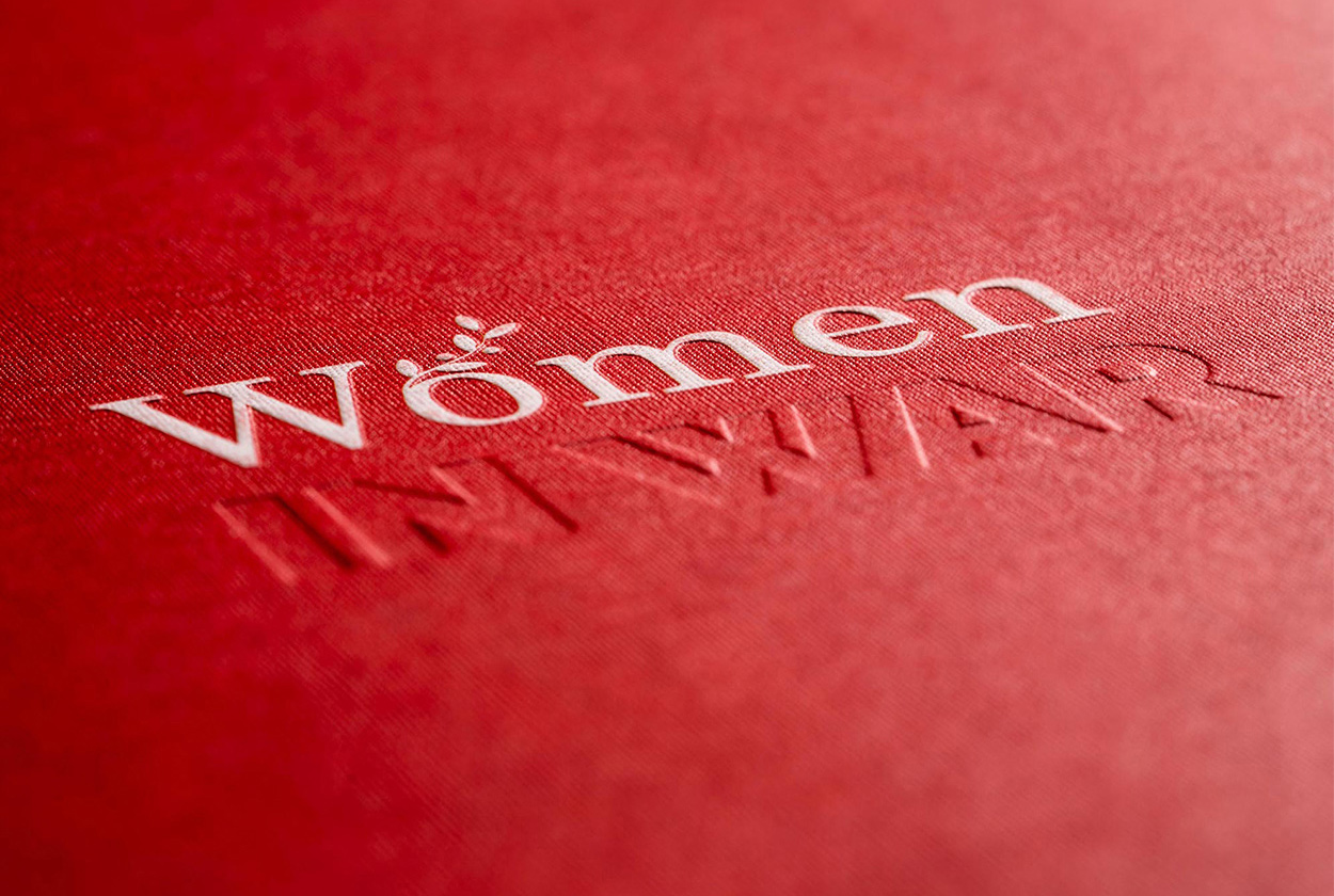
The International Committee of the Red Cross organised an event in Kuwait City called ‘Women in War’ to raise awareness on the situation of women caught up in armed conflict.
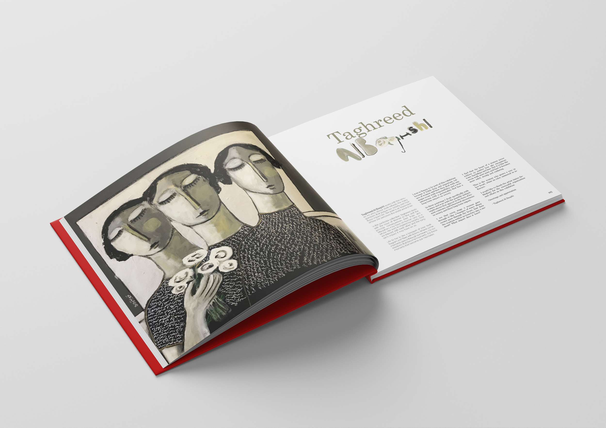
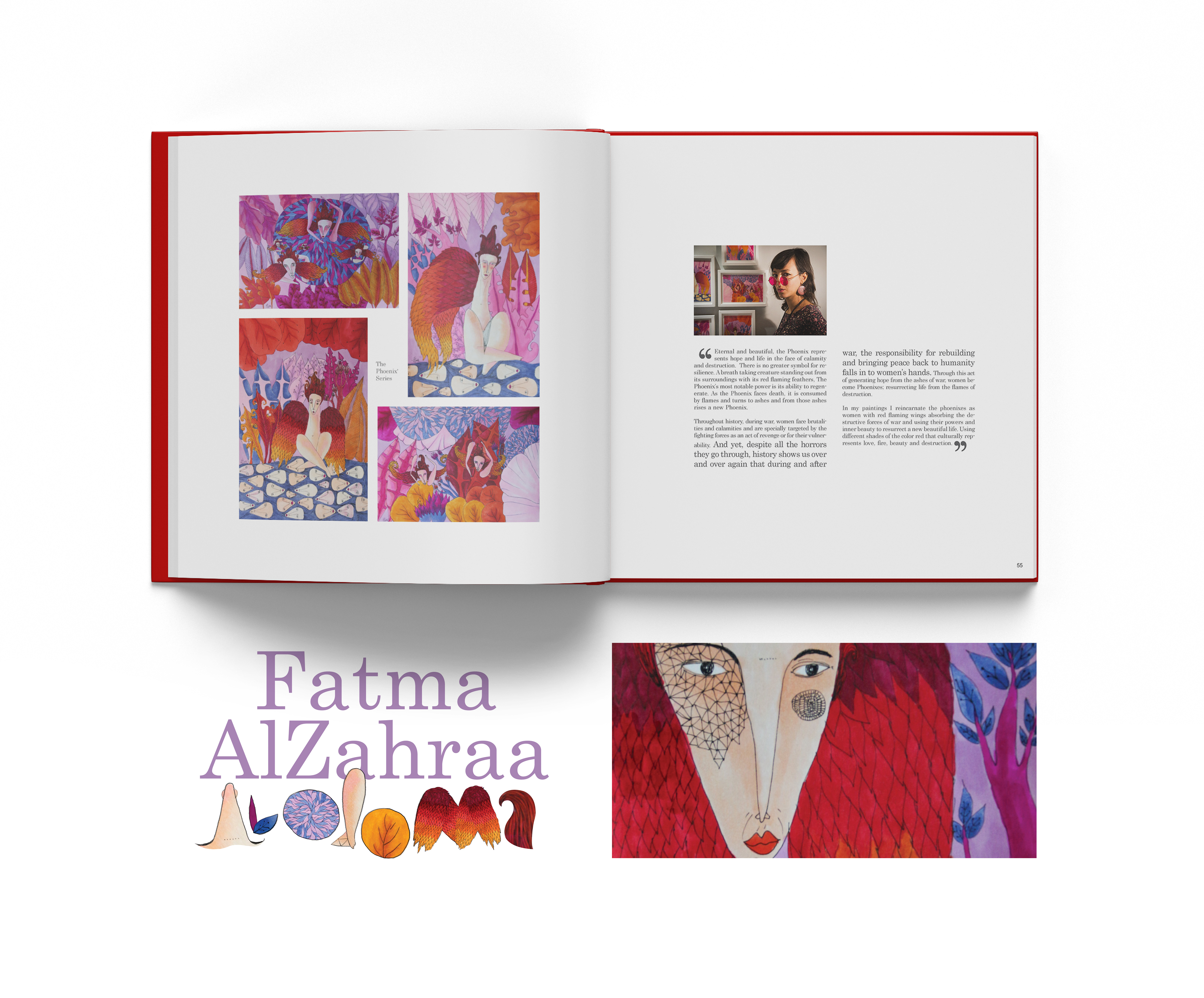
A book by the same name was unveiled to reflect on their incredible power of resilience, bringing together the experiences and insights of many talented artists from the region.
***Illustration
Layout & Book Design
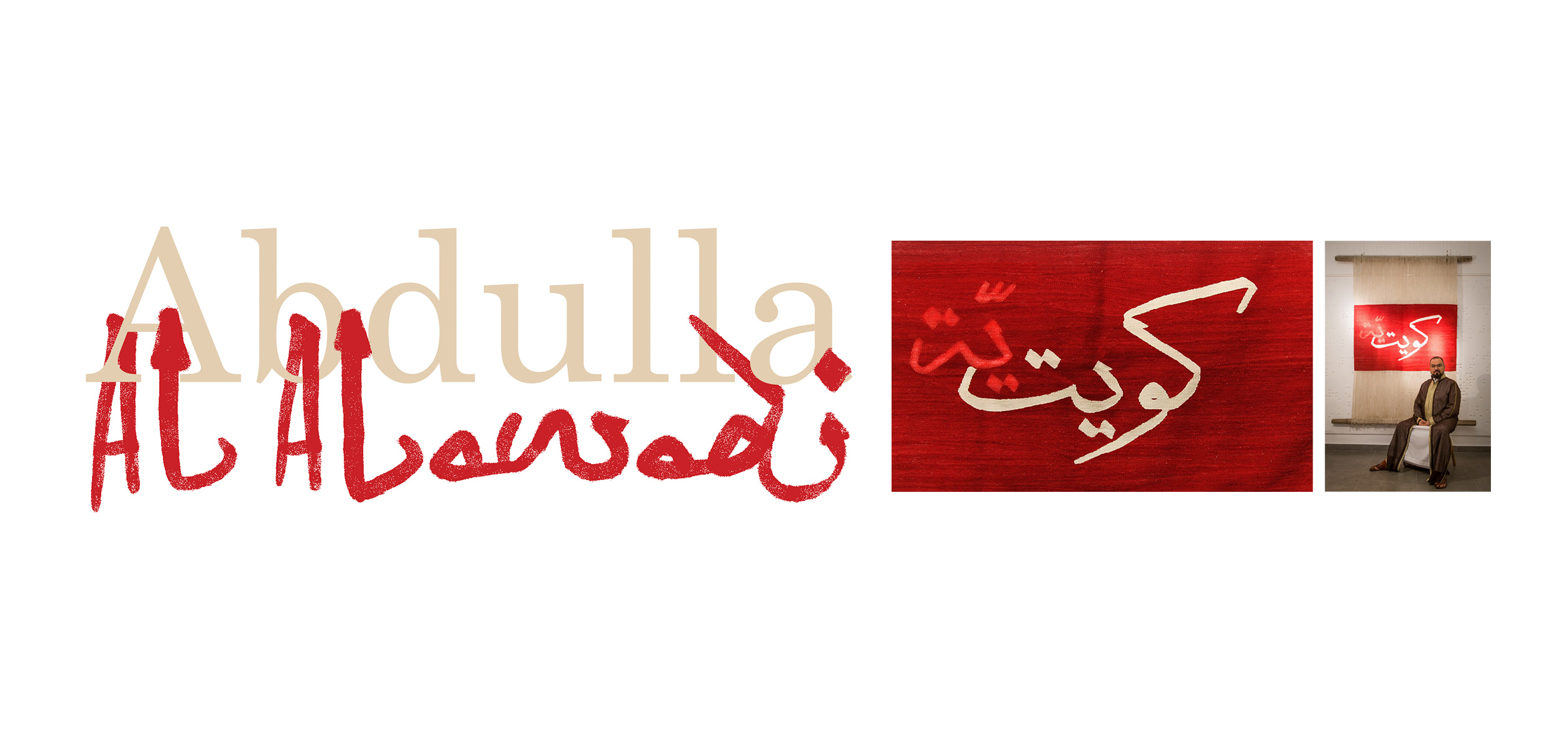
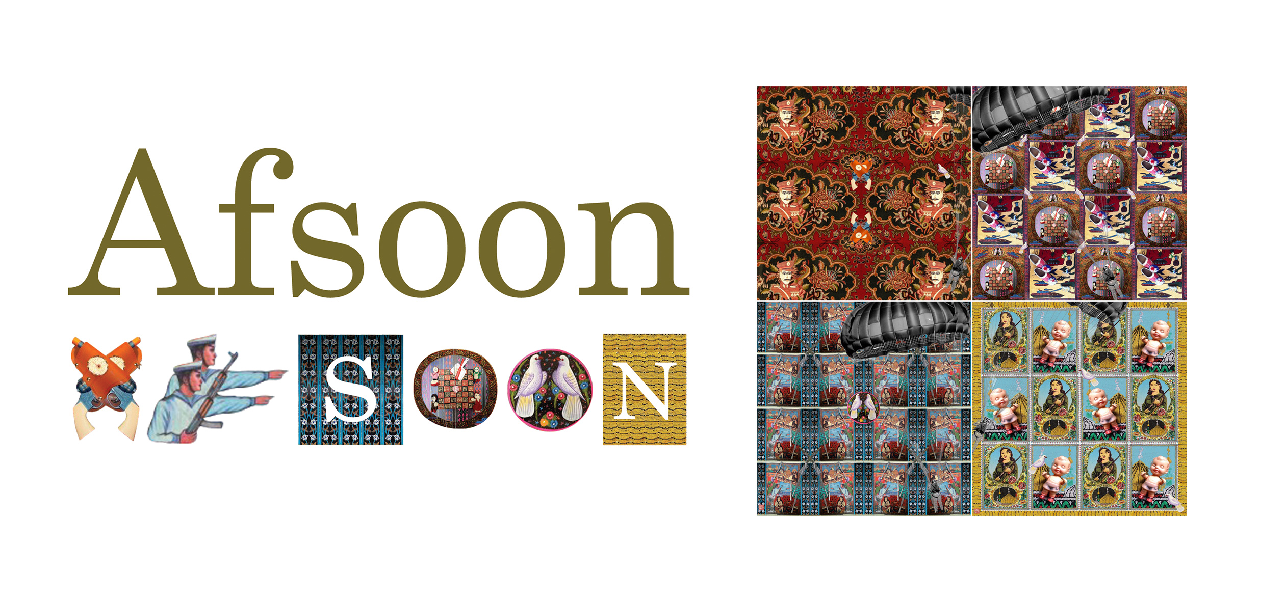
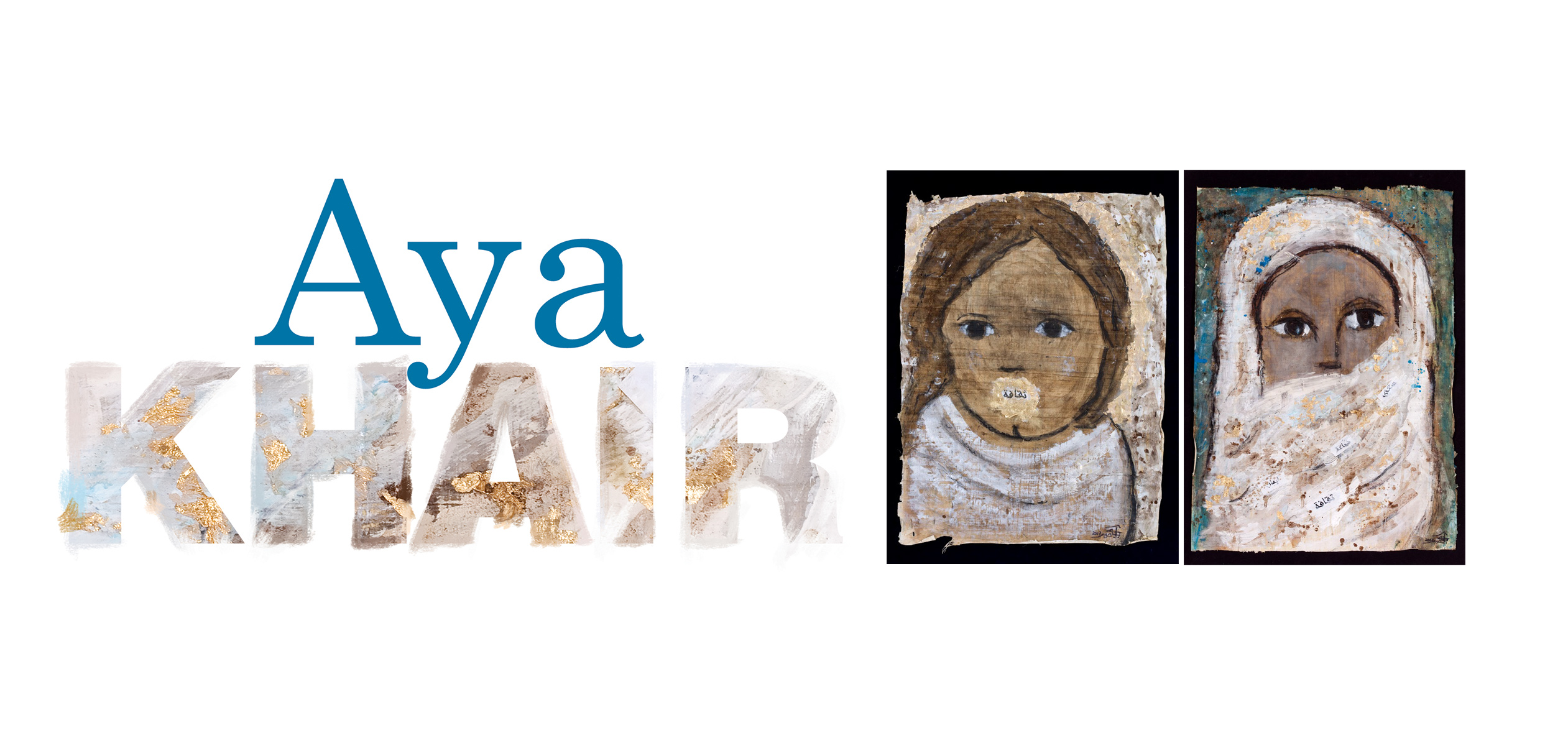
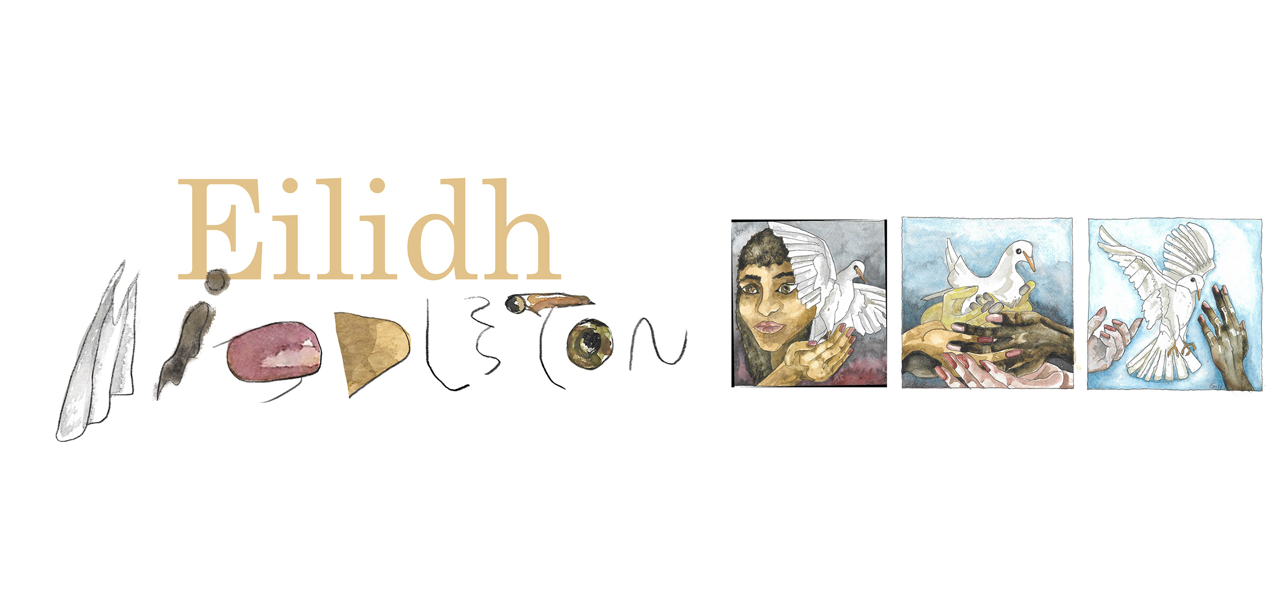
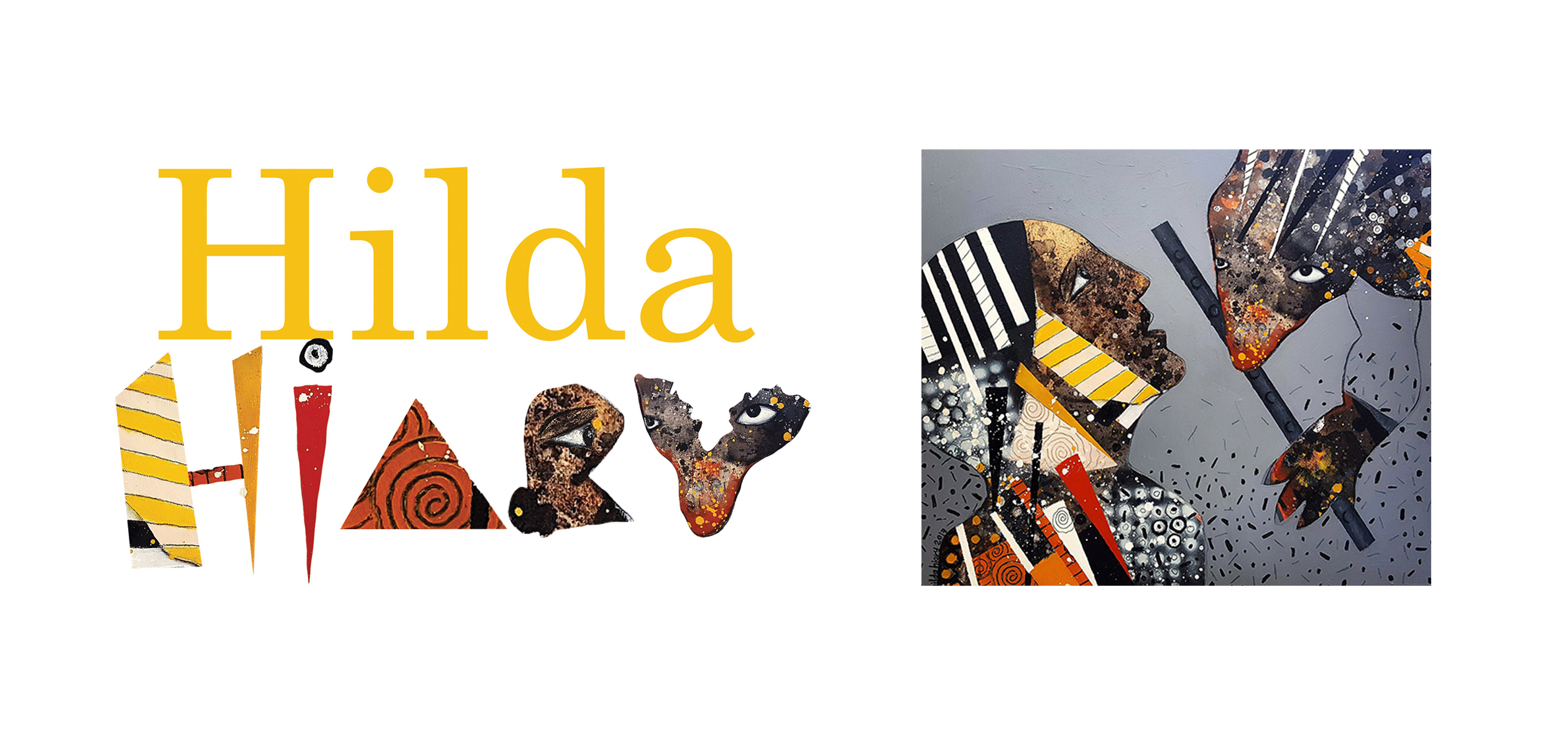
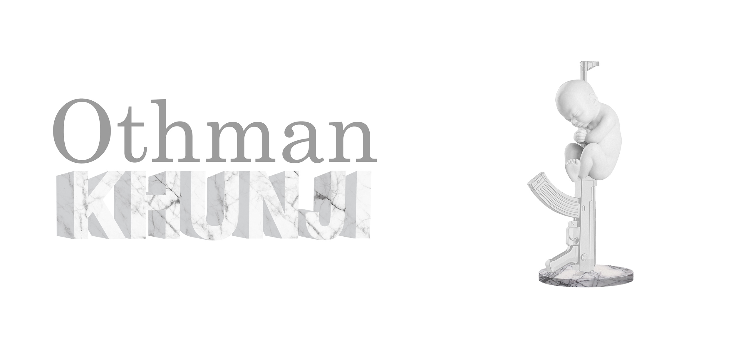
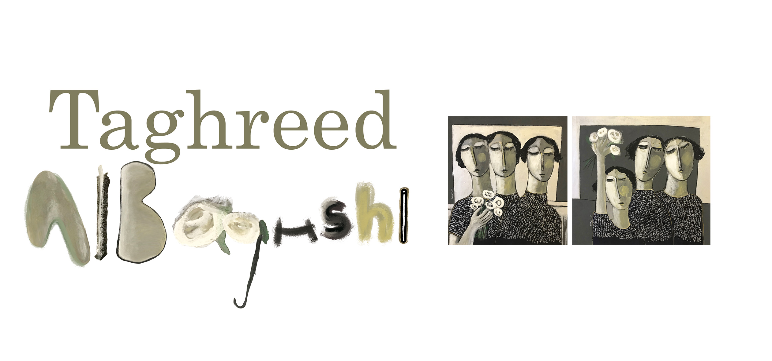
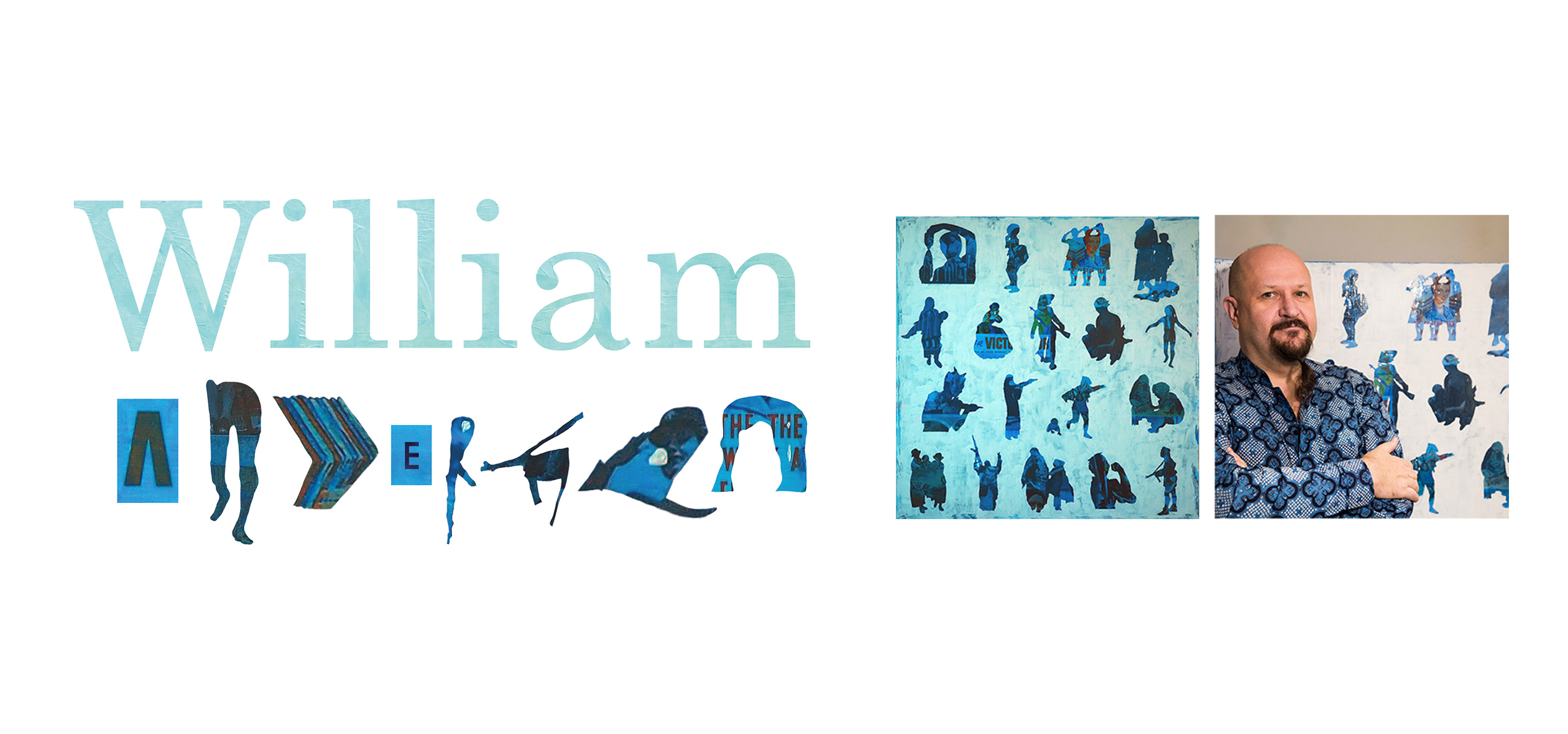
***Adapted the work of 24 artists to represent each one’s name in their own signature style. It involved acrylic paints, fabrics, charcoal, water-colours and sculptures.
@yellowsubmarine.me
with Senior Graphic Designer Huzaifa Kakumama


Imtinan
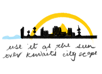
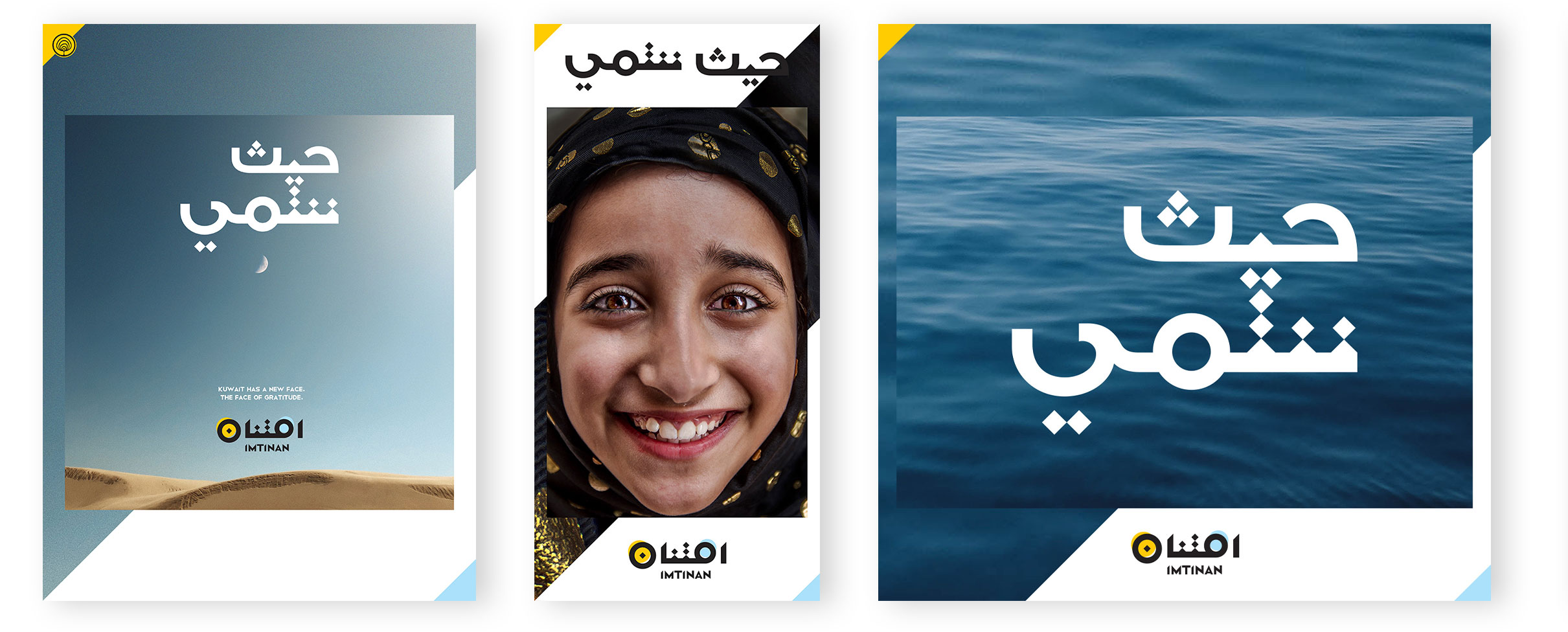
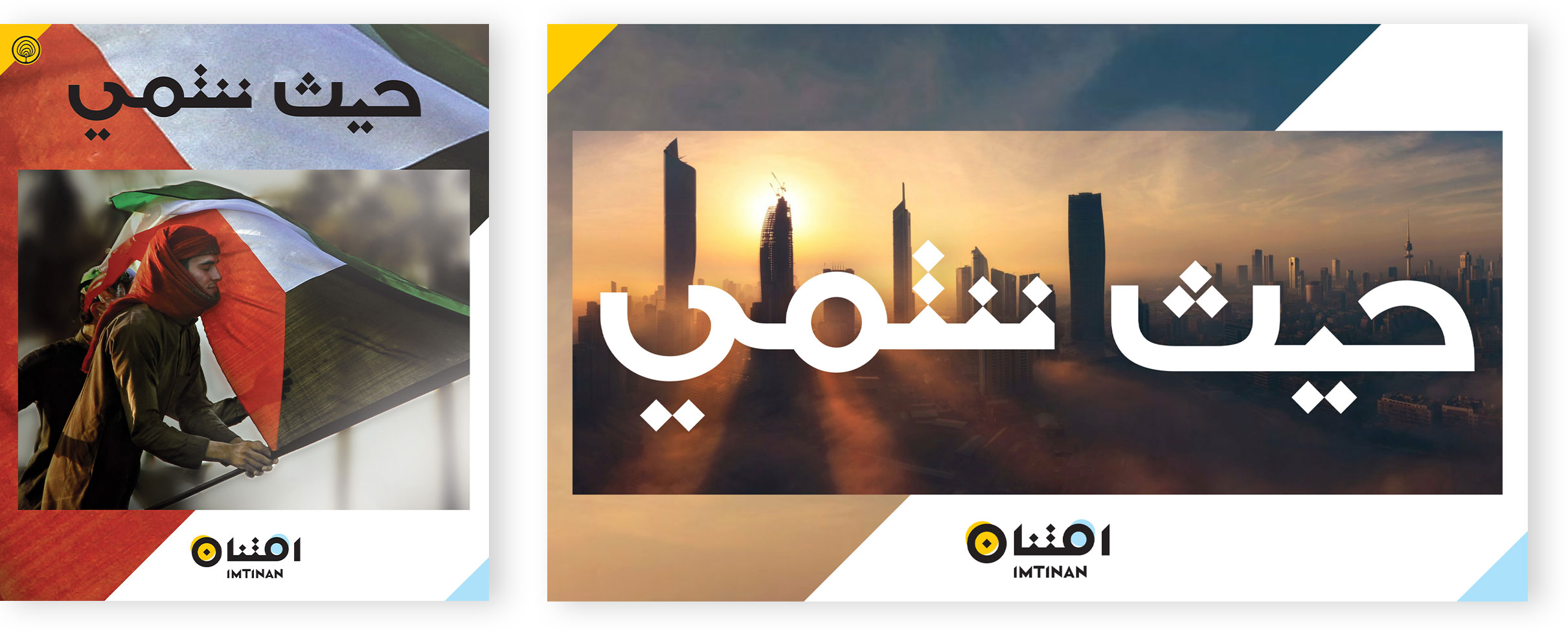
Imtinan’s mission is to generate greater public awareness and appreciation for the many positive aspects of kuwait.
Logo Design
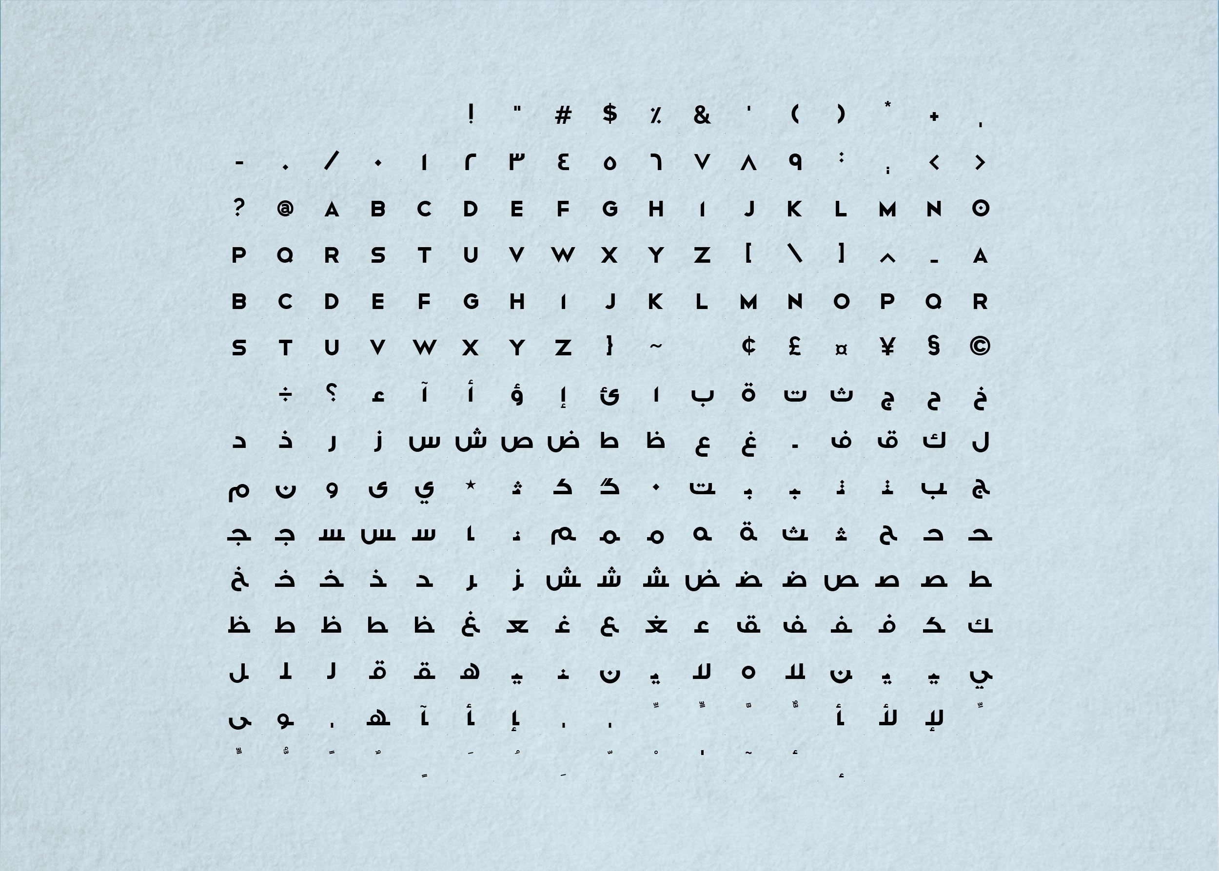
Font Design
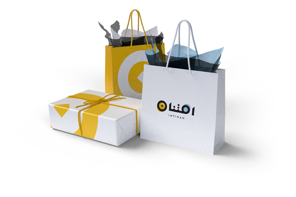
Collateral Design
Imtinan is Arabic for ‘GRATTITIUDE’
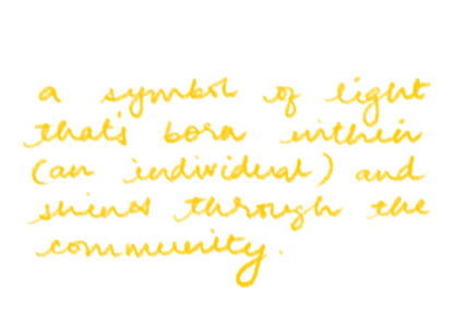
Being grateful and showing appreciation is the most positive response to the gifts that life gives us. It gives us a sense of completion; making us better, stronger people –
AS INDIVIDUALS AND AS A COMMUNITY


Imtinan is Arabic for ‘GRATTITIUDE’
Being grateful and showing appreciation is the most positive response to the gifts that life gives us. It makes us feel complete; making us better, stronger human beings –
AS INDIVIDUALS AND AS A COMMUNITY


The arabic letter nūn is a sun letter (shamsi).
It is also used as the prefix for first-person plural.
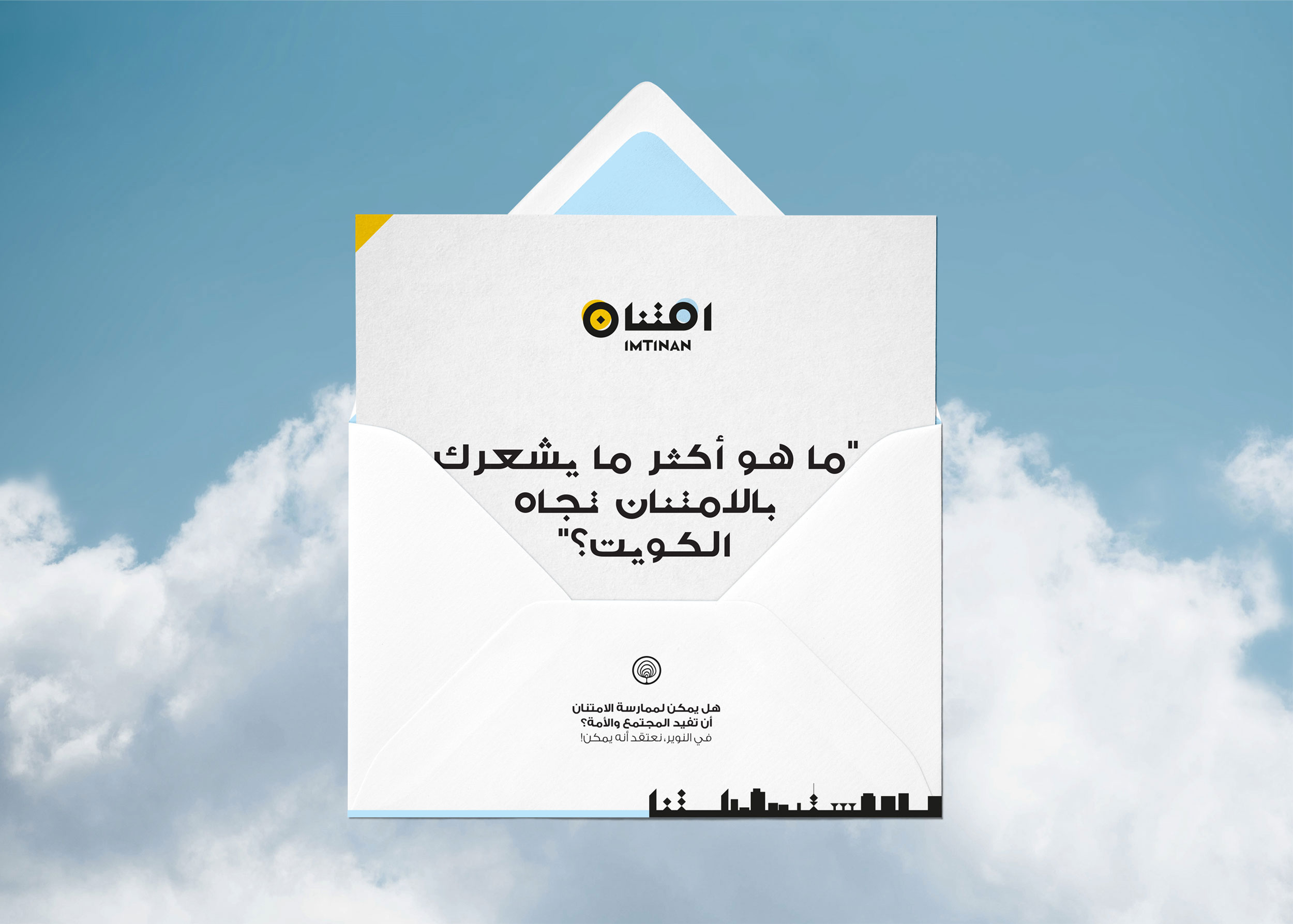
Can practicing gratitude
benefit our nation?
At Alnowair, we believe it can!


The photos above are a selection from Alnowair’s “Focus on the Good” photography competition and are property of the individual photographers/ Alnowair

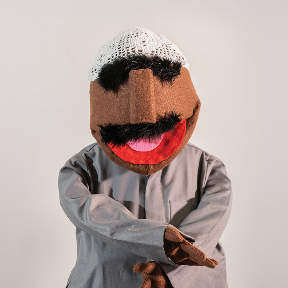
Puppets!
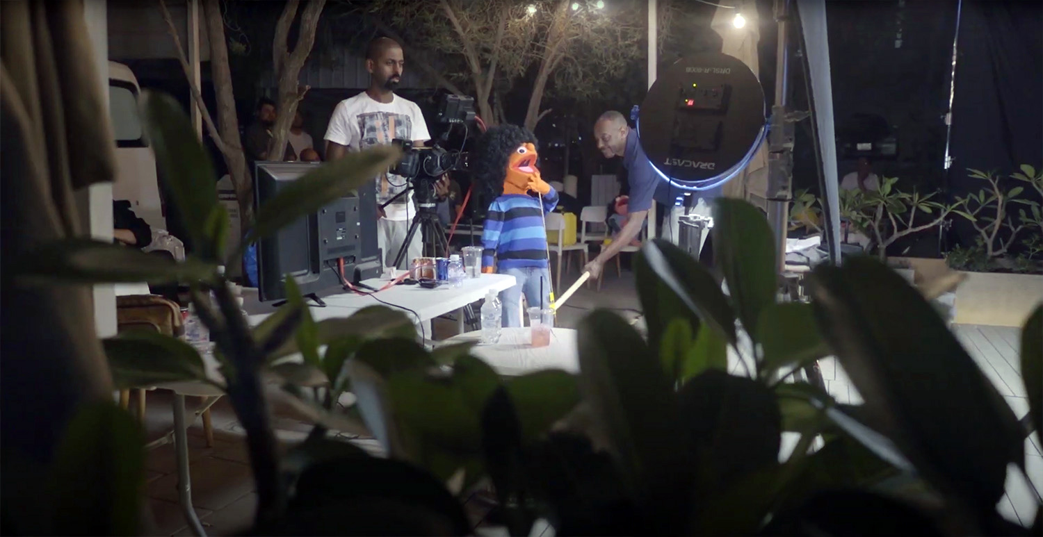
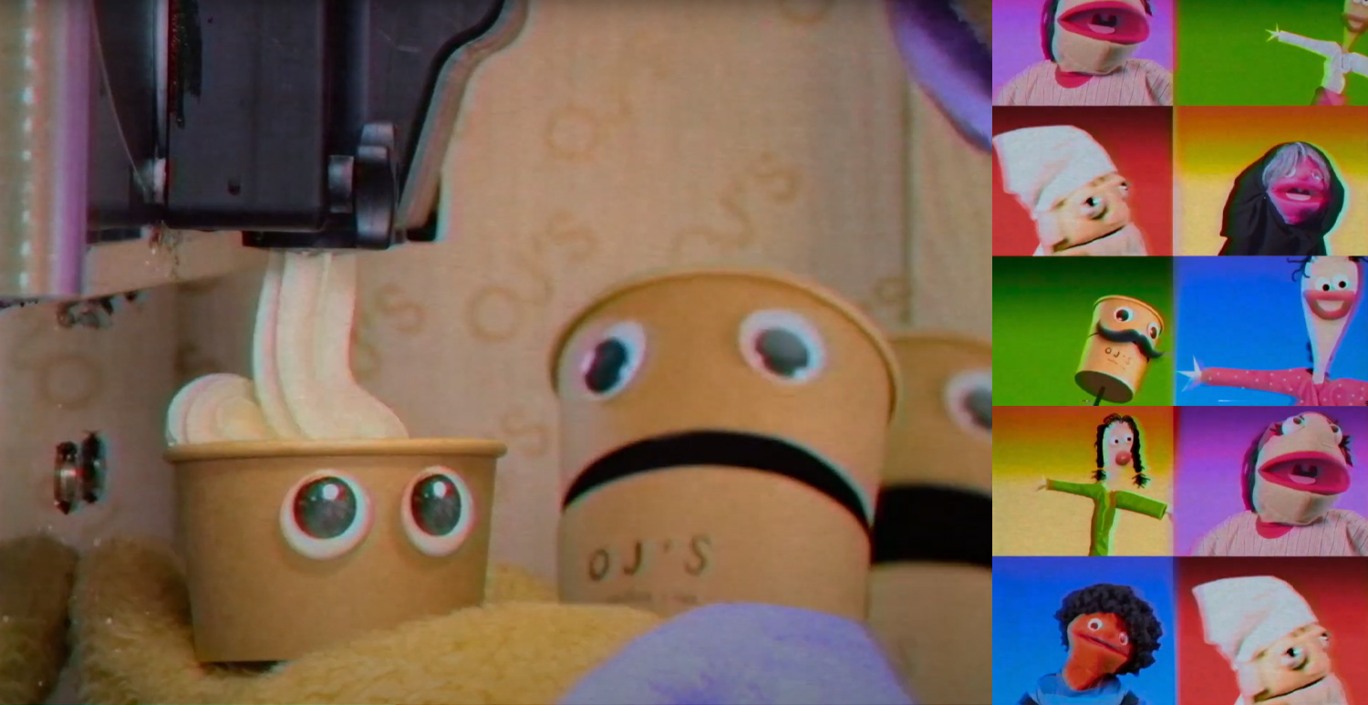
Seven puppets were hand-made in seven days for OJ Cafe’s advertisement
(Agency: MB Vision)
Hand-made Puppets
Character Development
Costume Design
@yellowsubmarine.me
with Production Manager Jad Sharara, Senior Graphic Designer Malak Sahli
and sleepless nights of help from mom, dad and my unstoppable wife :)
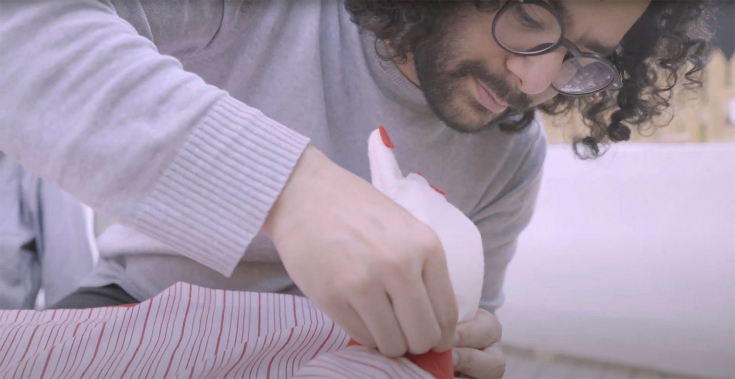
Making of the Puppets
Shot by Alvin Frankie @YellowSubmarine.me
The Ad
Disclaimer: This video is the property of MB Vision/ OJ’s Cafe
Watch behind the scenes here


Prismologie
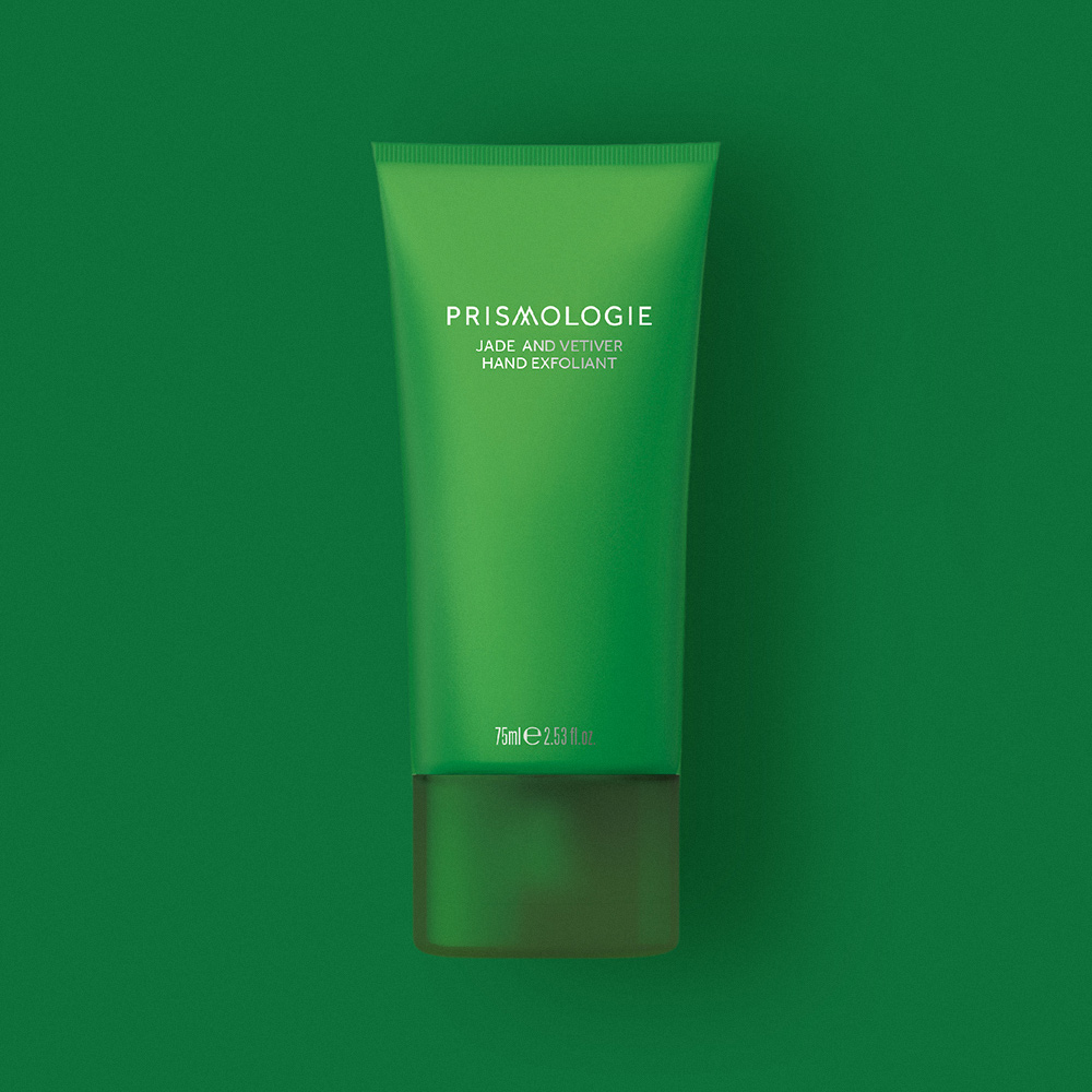
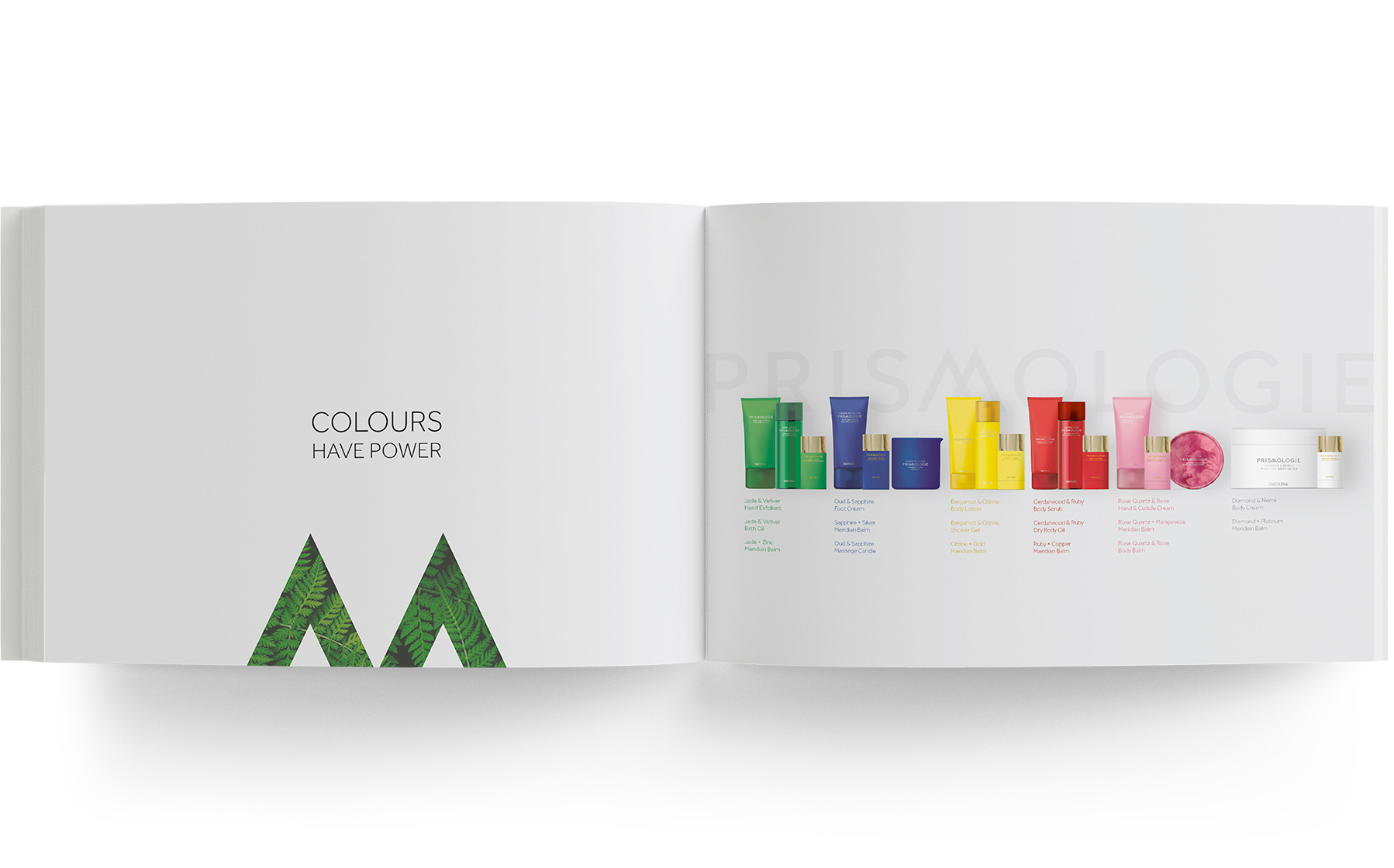
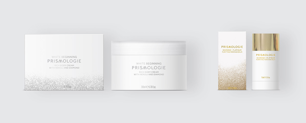
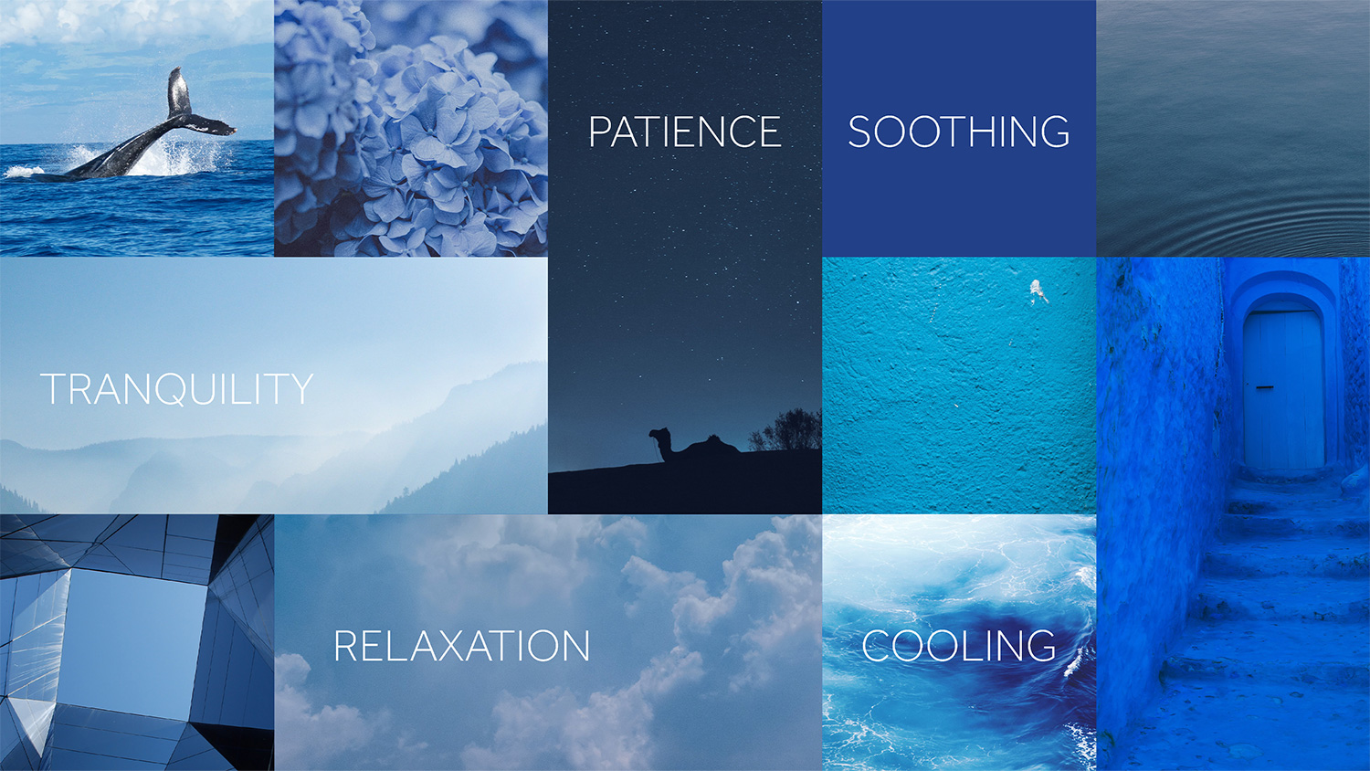
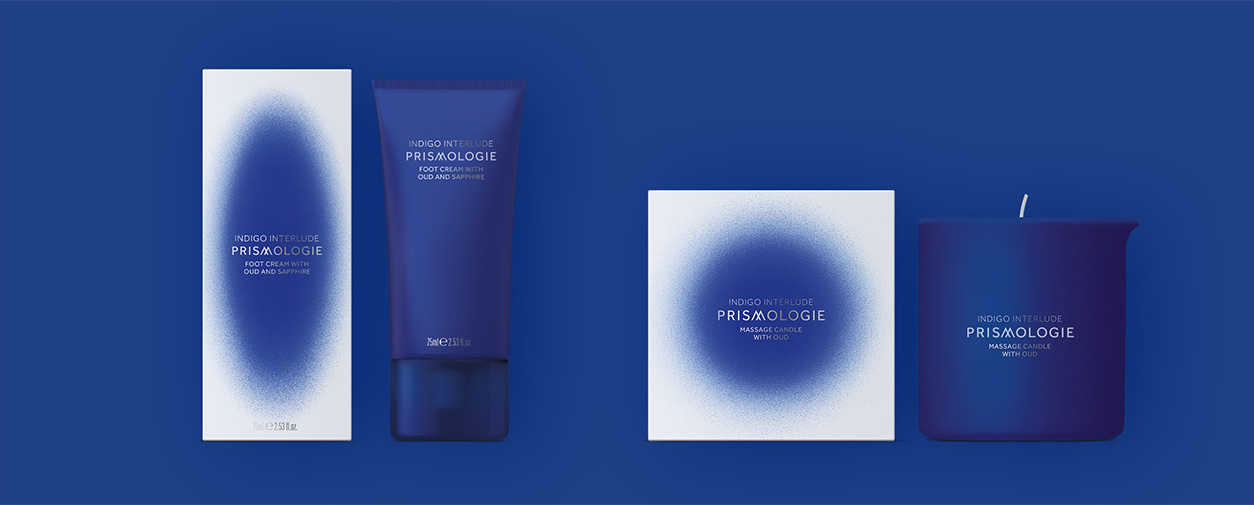
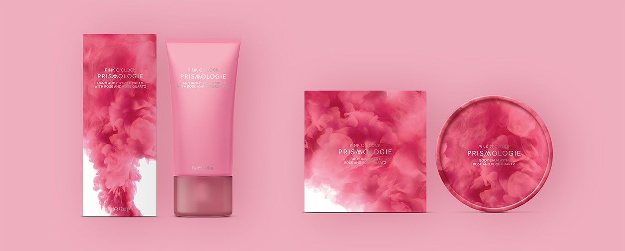
Prismologie is a natural mood-enhancing body care range that harnesses the transformative power of colours. Working with leading perfumers, they created fragrances that unfold to reveal each colour’s hidden depths, and complement specific qualities: neroli for clarity, bergamot for confidence, rose for comfort, vetiver for serenity, cedarwood for vigour and oud for stillness.
Brand Positioning
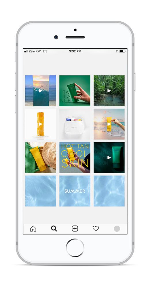
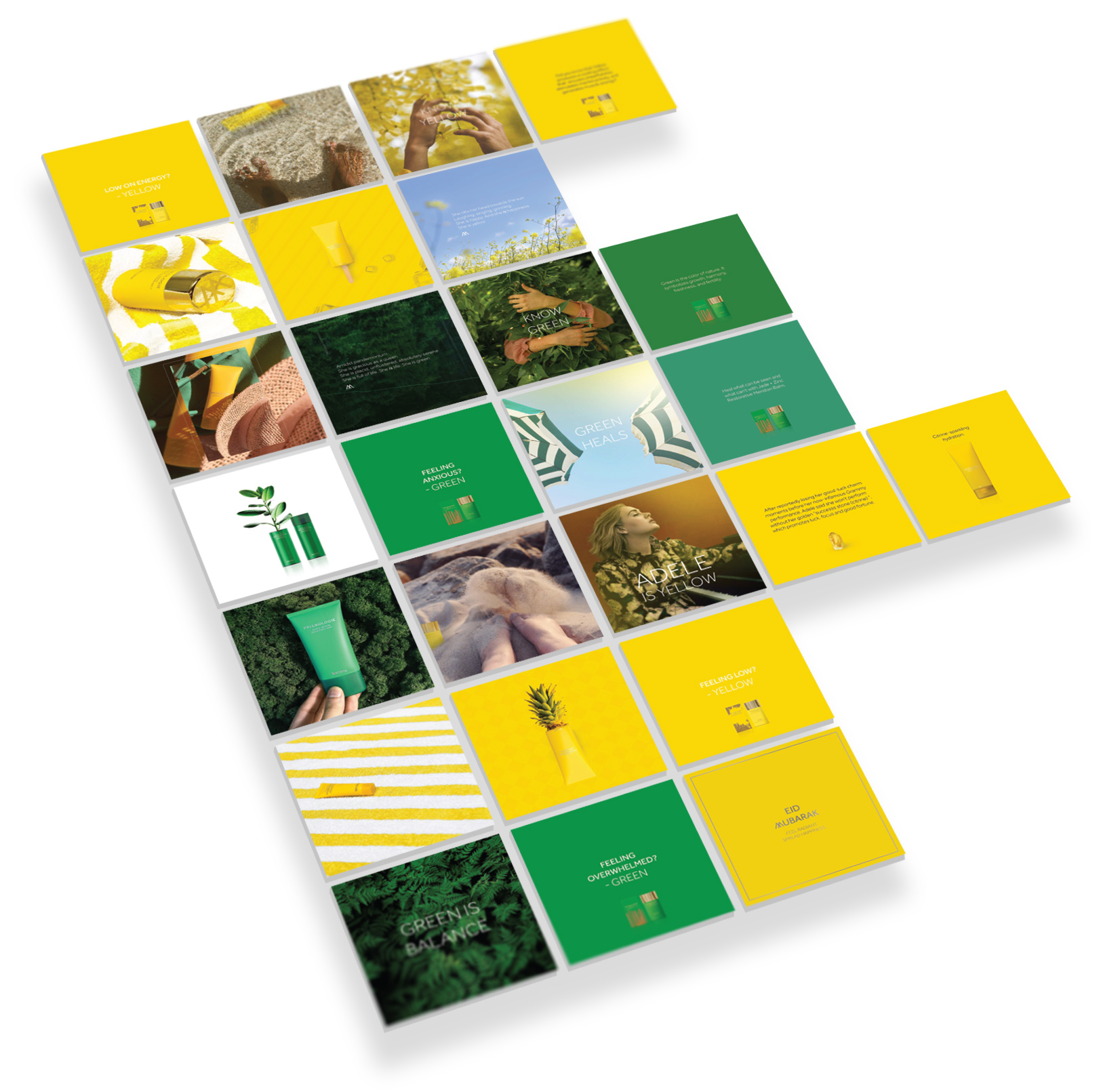
Revamping Social Media Strategy
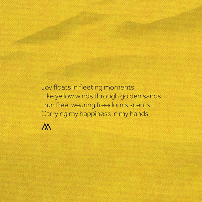
Copywriting/ Poetry
Brand Profile Design

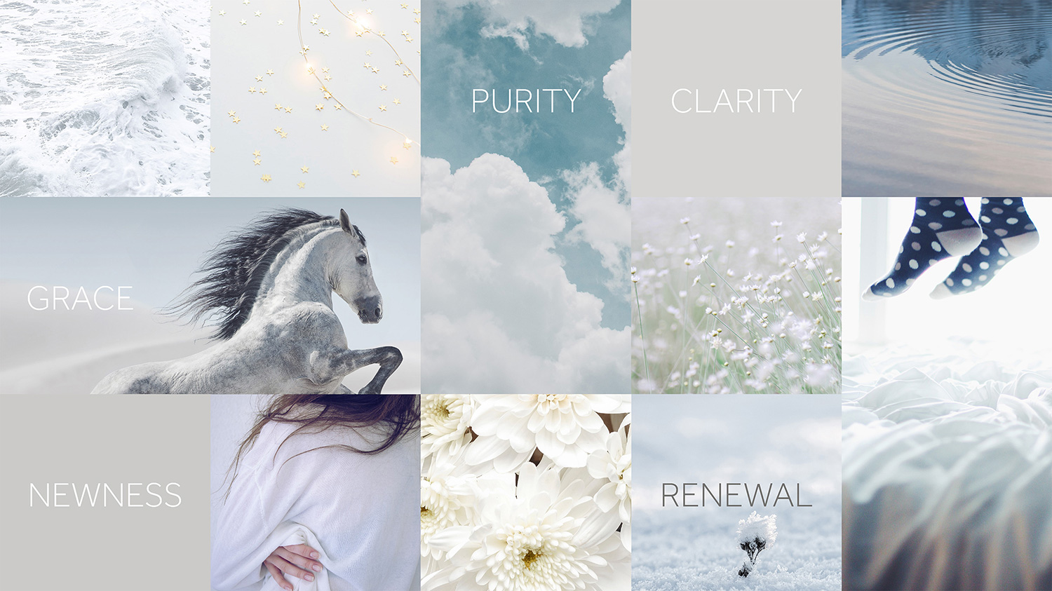
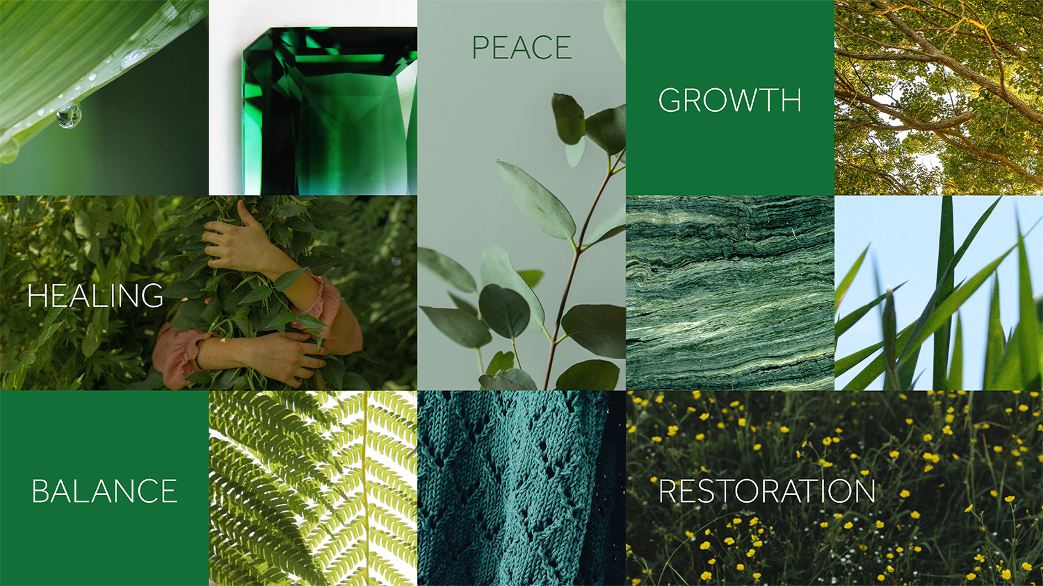


WHO IS SHE?
At around 28, our most desired target consumer associates herself with meaningful brands that have a broader purpose behind their existence. She believes that a brand should simplify her life, make her feel confident and closer to the people she loves. A brand that remains ethical and mindful towards the planet.


Motion graphics by Predrag Nikolic


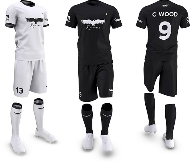
Ravens FC
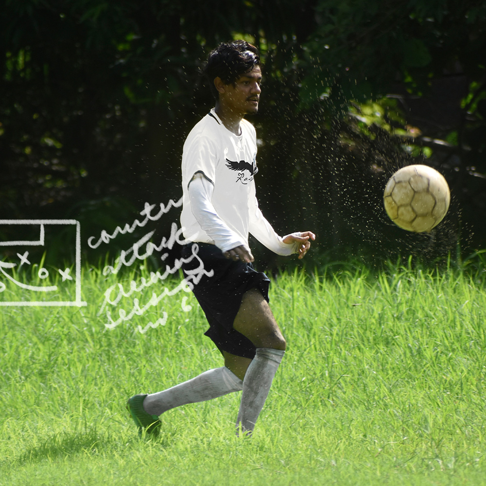
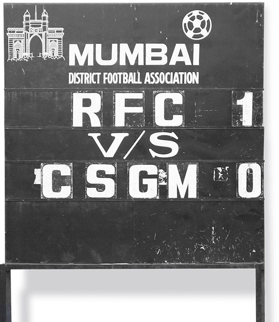
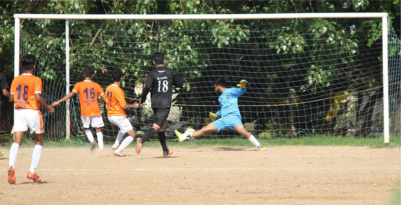
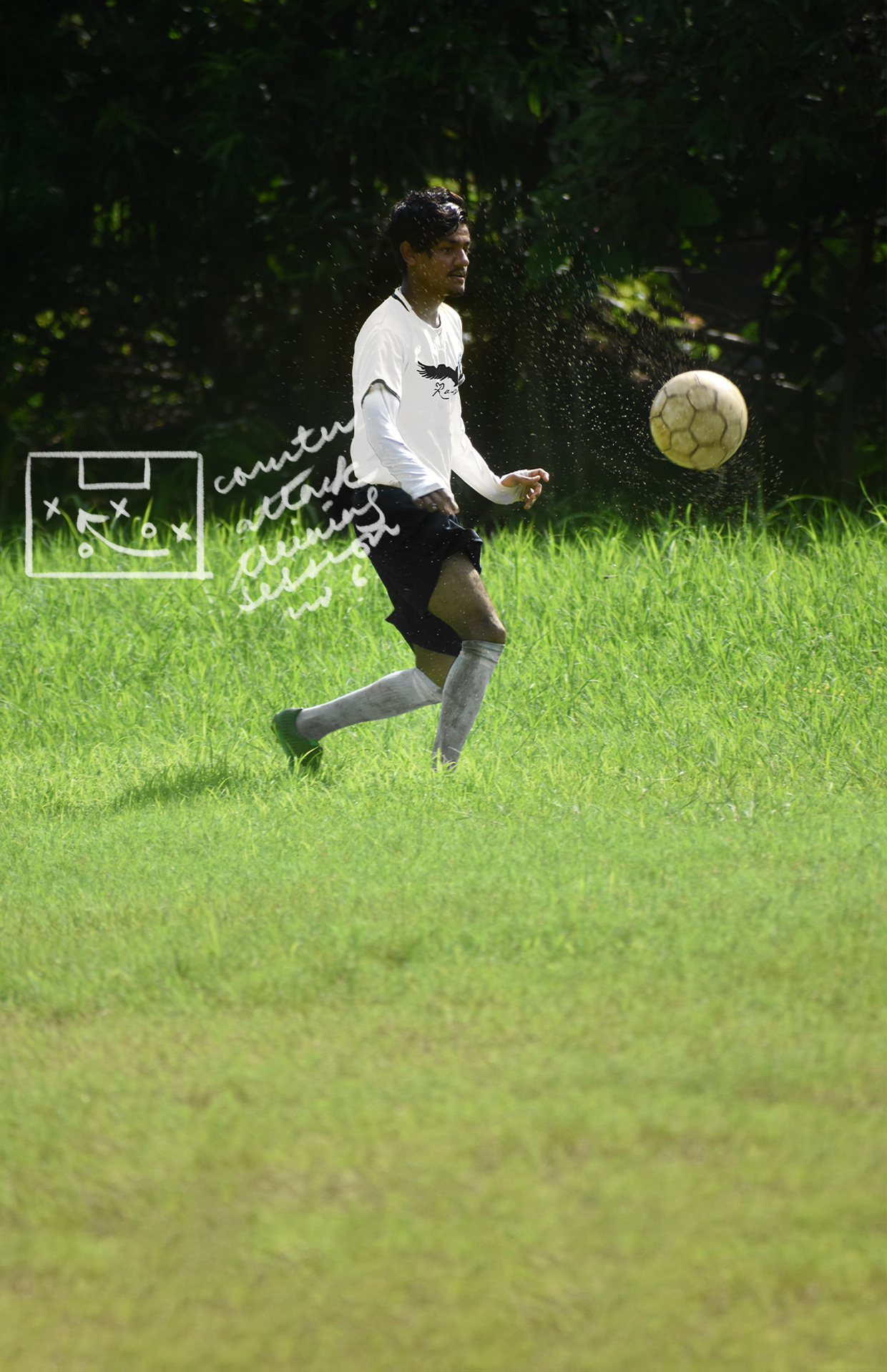
A football team formed in late 2008, Ravens FC, has grown into a training and scouting association. Managed by Nihar Shah and his team of local coaches in Bombay, it is a centre for homegrown talent.
Dedicated to help youth reach their full potential, Ravens Football Club aims to help them realise life goals where individuals, families and communities thrive.
Brand Identity
Brand Name
Logo Design
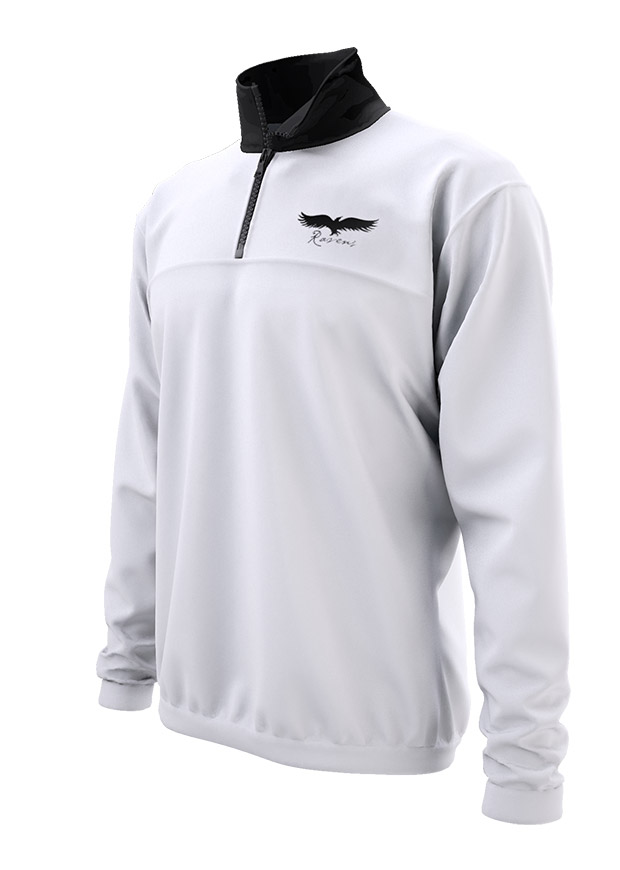
Team kit & Merchandise Design
Stationery Design
Website Design





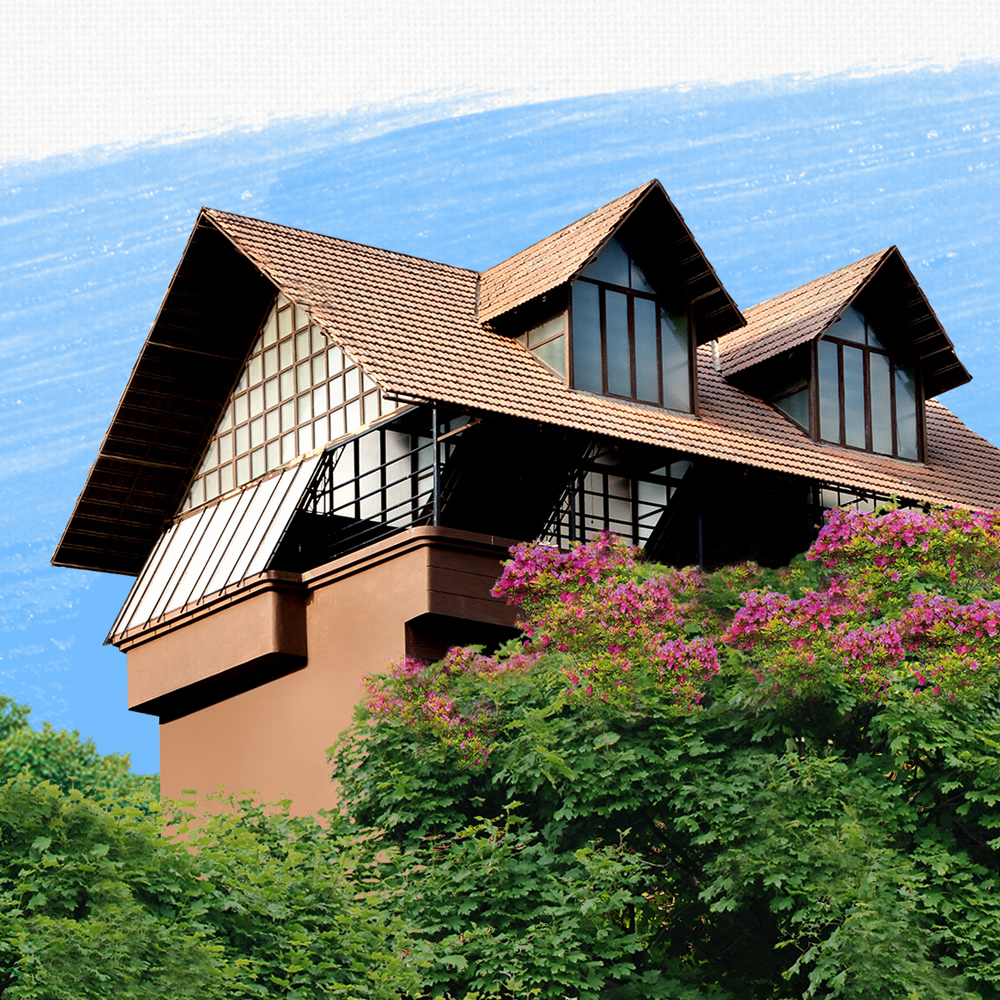
Temperance
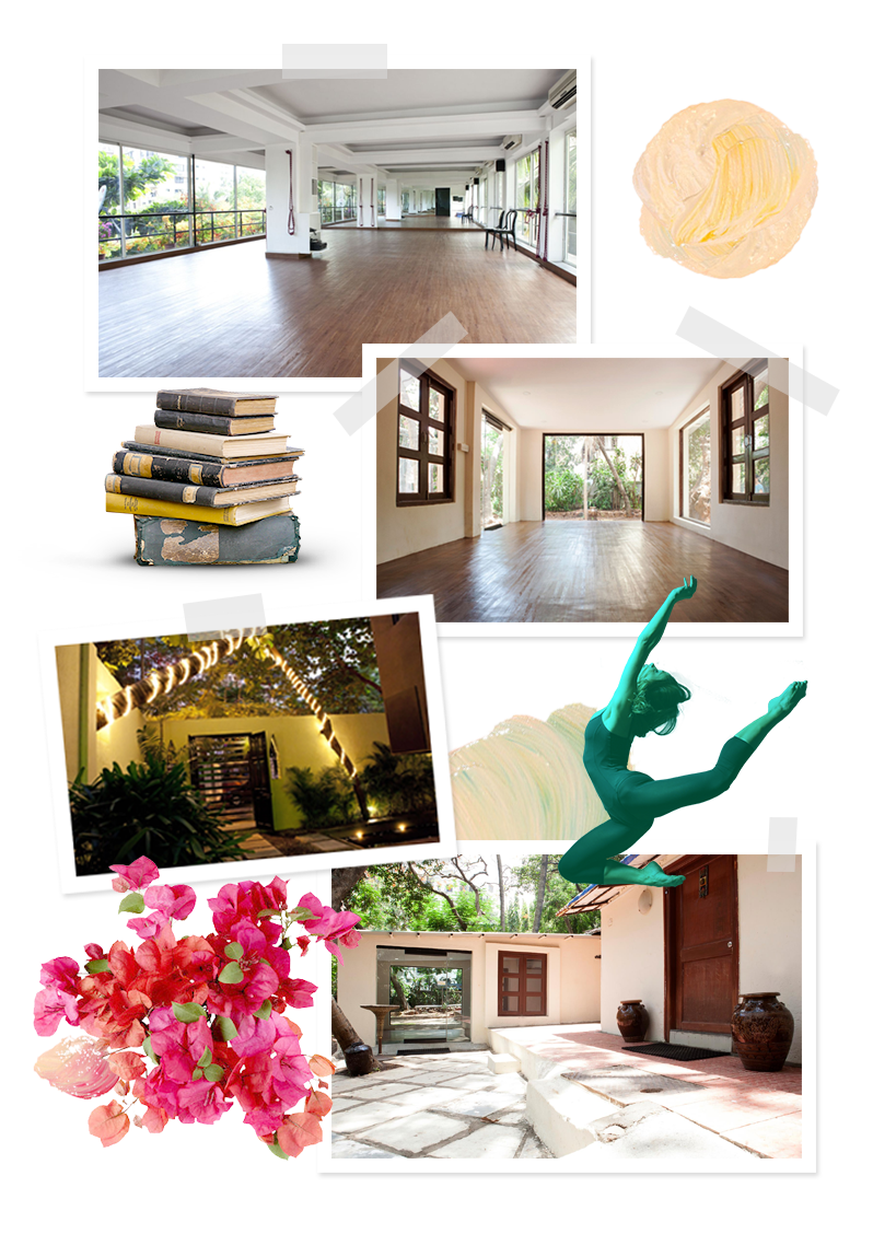
Temperance is an all-inclusive cultural haven, set in the midst of bustling Bombay city. With loads to offer, it houses martial arts, dance, yoga, theatre and an art gallery – all under one, single, stately roof.
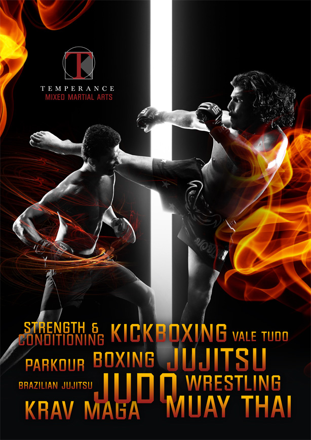
The designs offered to represent the place had to encapsulate all of that – different styles, treatments, textures – yet maintaining a consistent identity.
Brand Identity
Logo(s) Design
Stationery Design
Illustration
Marketing Collaterals


Temperance /ˈtɛmp(ə)r(ə)ns/
is moderation in thought, feeling and action.
The logo had to embody the essence of voluntary self-restraint. One free of excesses; representing balance and fulfillment. Inspired by Leonardo Da Vinci’s (& Roman architect Vitruvius’) Vitruvian Man, it is a symbol of symmetry and perfect proportions.




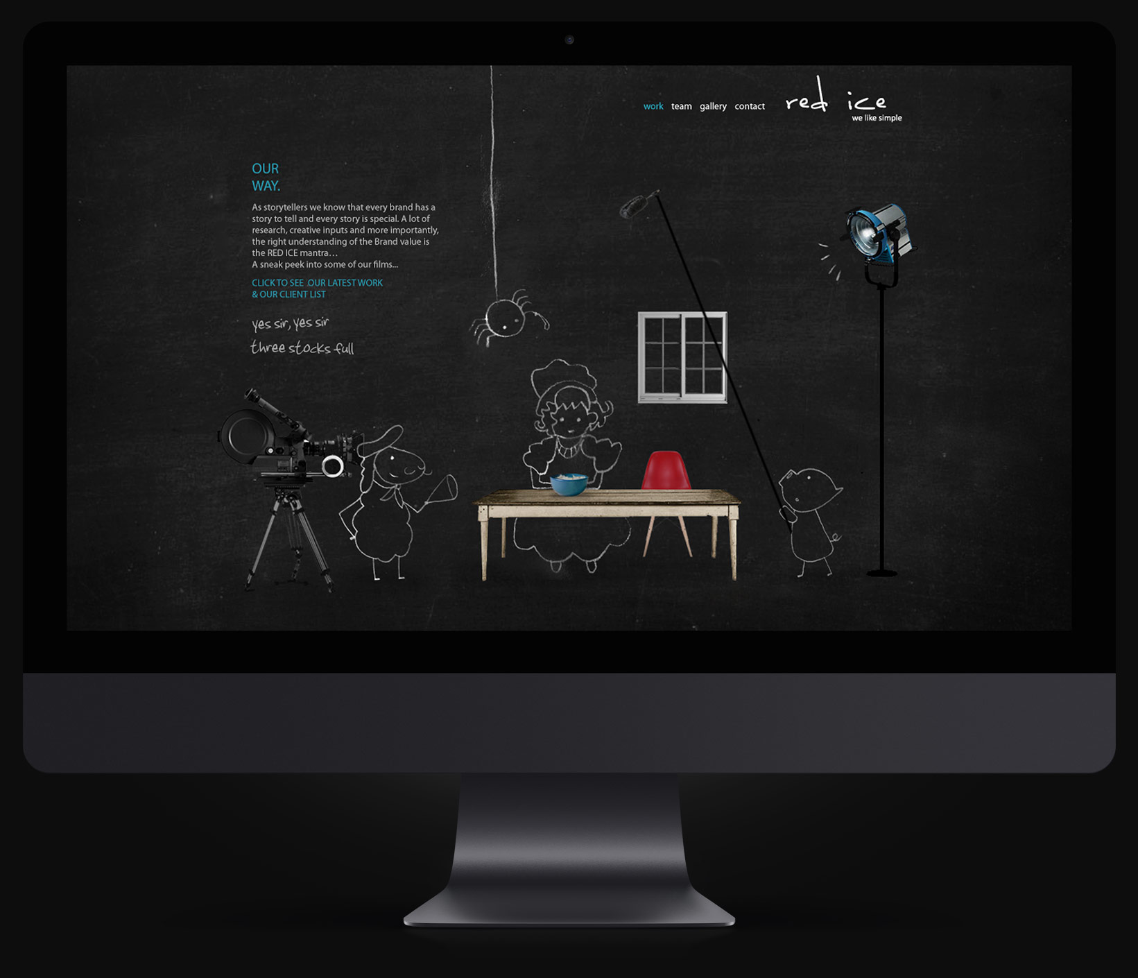
Red Ice Films
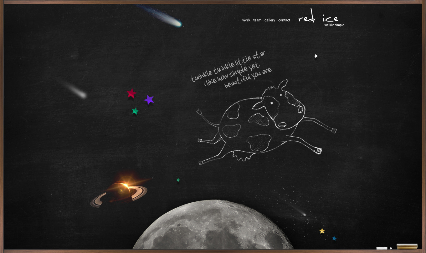
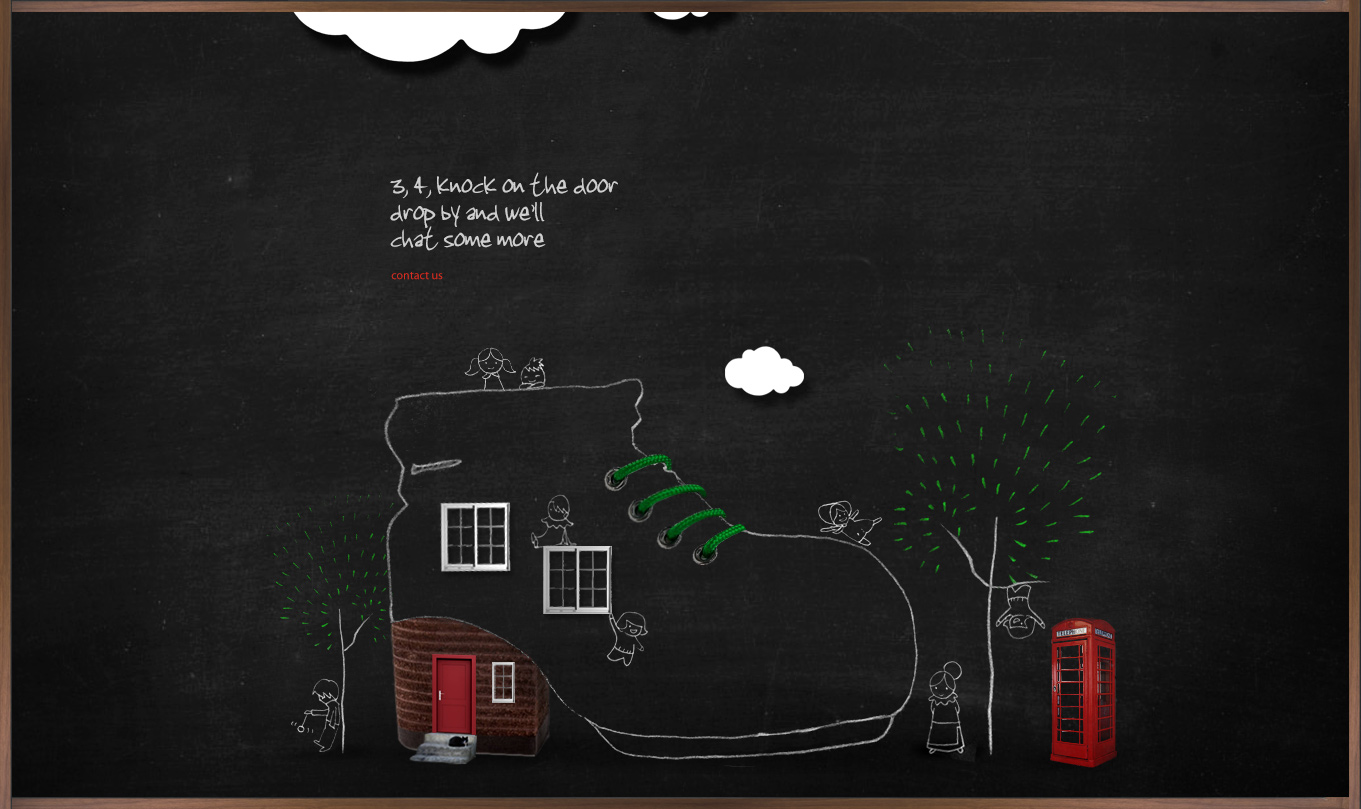
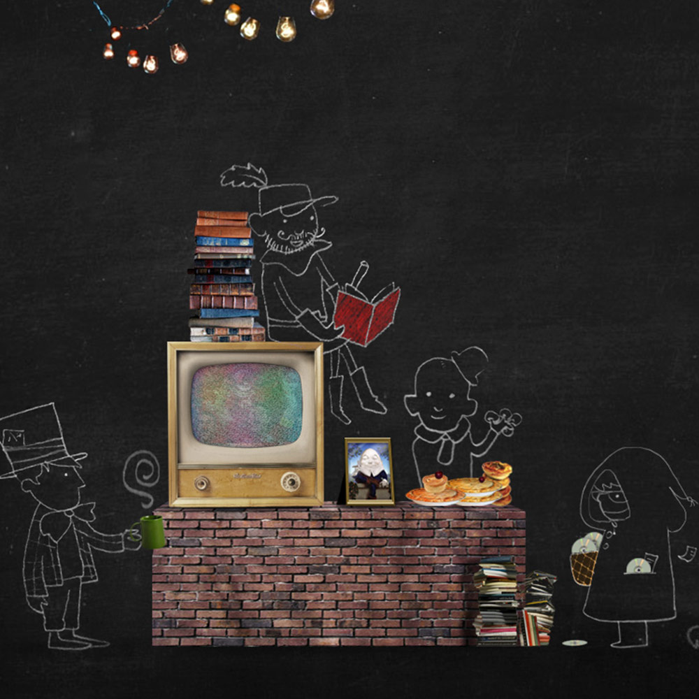
Red Ice films is a well-known production house making stand-out advertisements in India. Their website was designed around their (previous) slogan – “We like simple”.
The simplicity of nursery rhymes is much like the ads and jingles one remembers. Each page was designed with illustrations of nostalgic elements from some of the best known poems and specially written rhymes with a twist, to go with it.
Illustration
Copywriting
Website Design & Development
