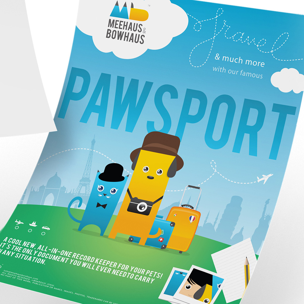
Pawsport
The PAWSPORT by Meehaus & Bowhaus turns a travel document into a vibrant all-in-one record keeper for your pet.
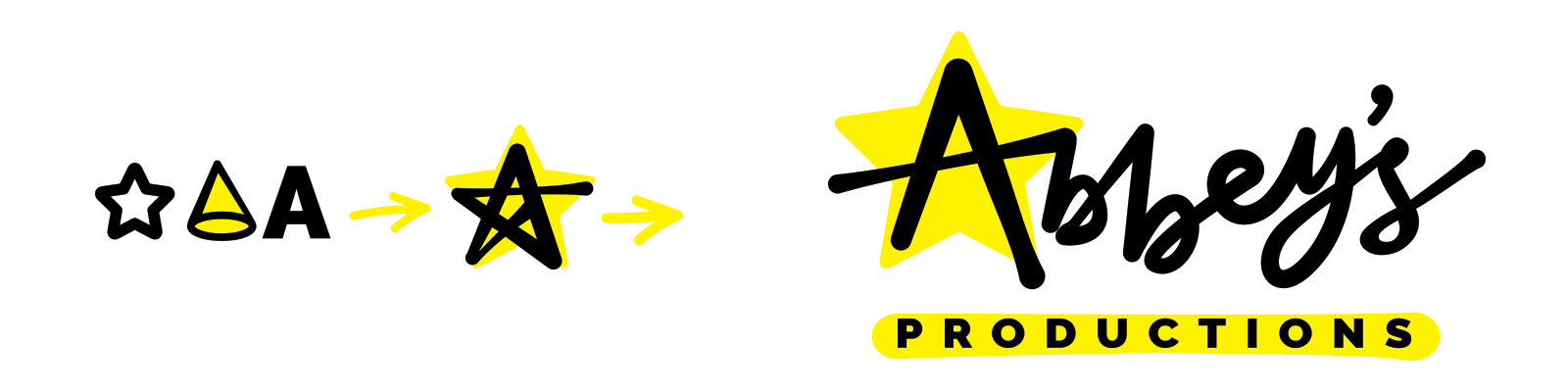
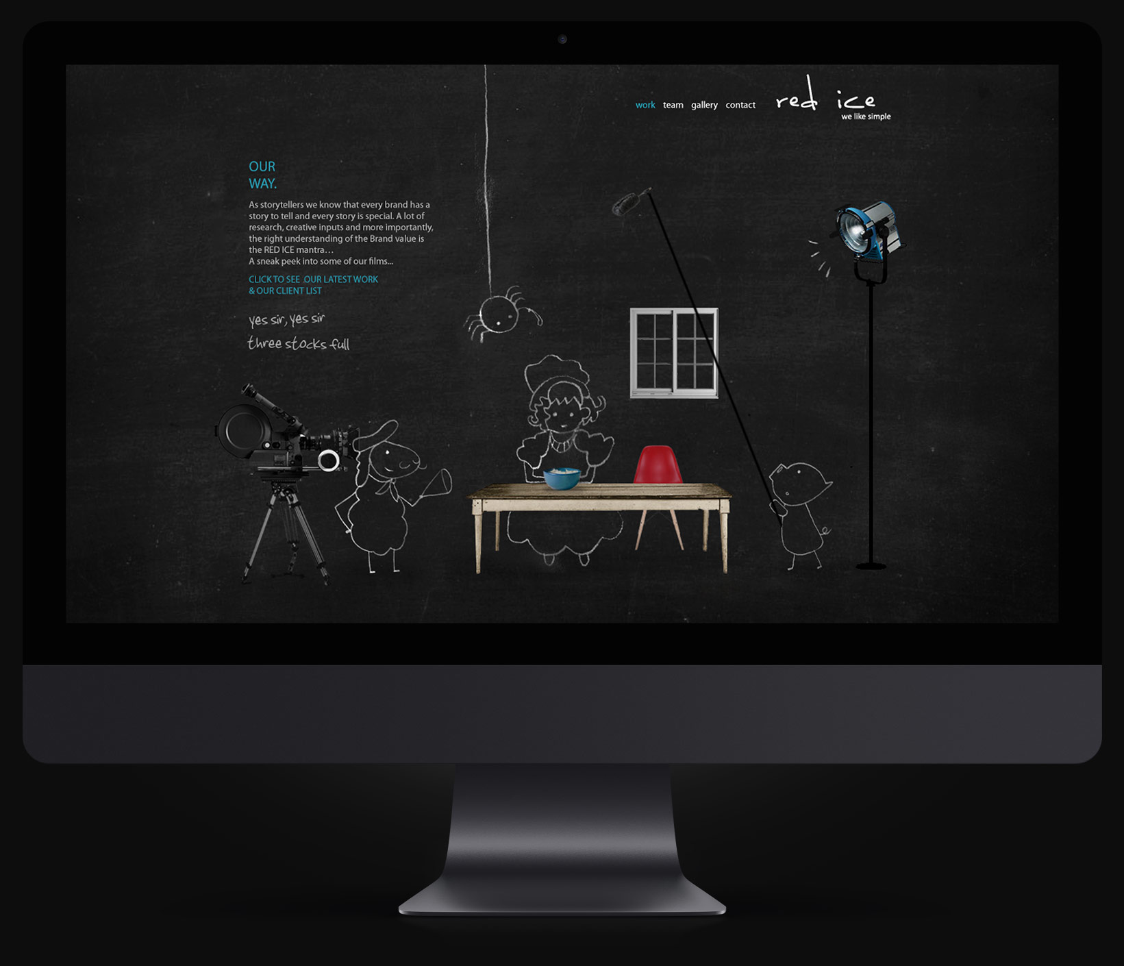
Logo Design
Mascot Design
Product Design
Illustration
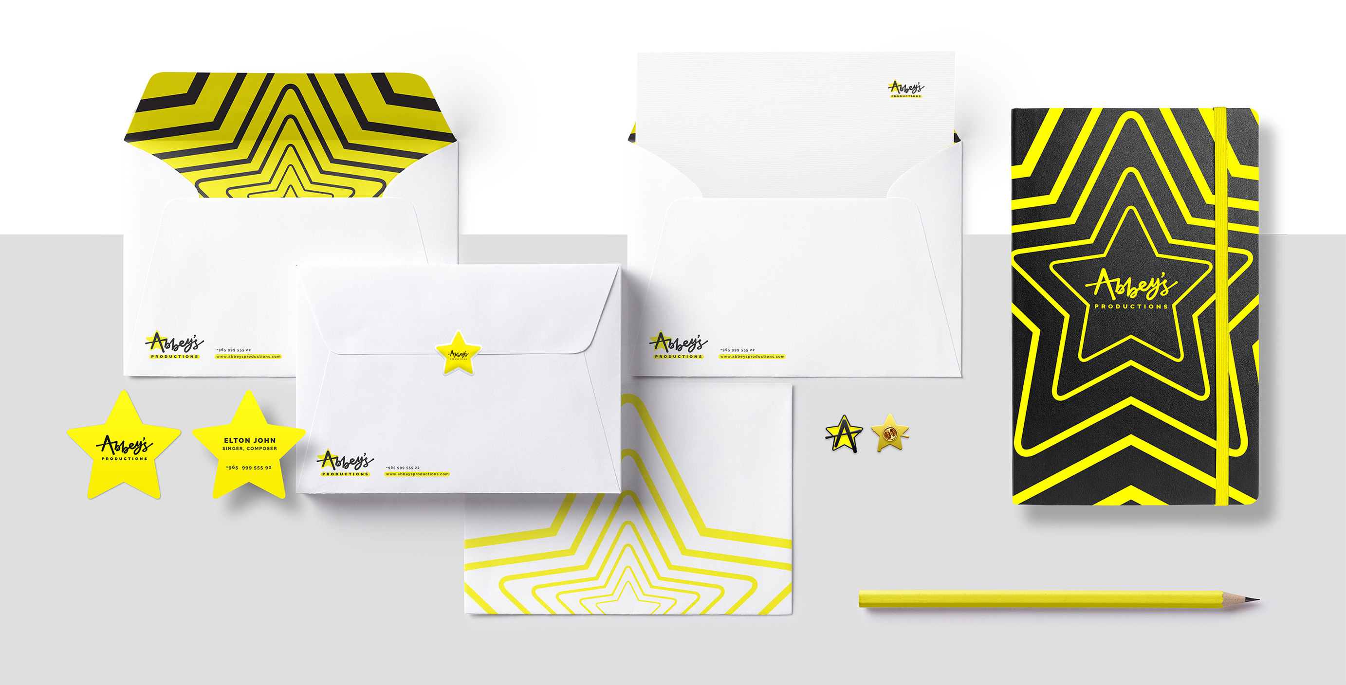
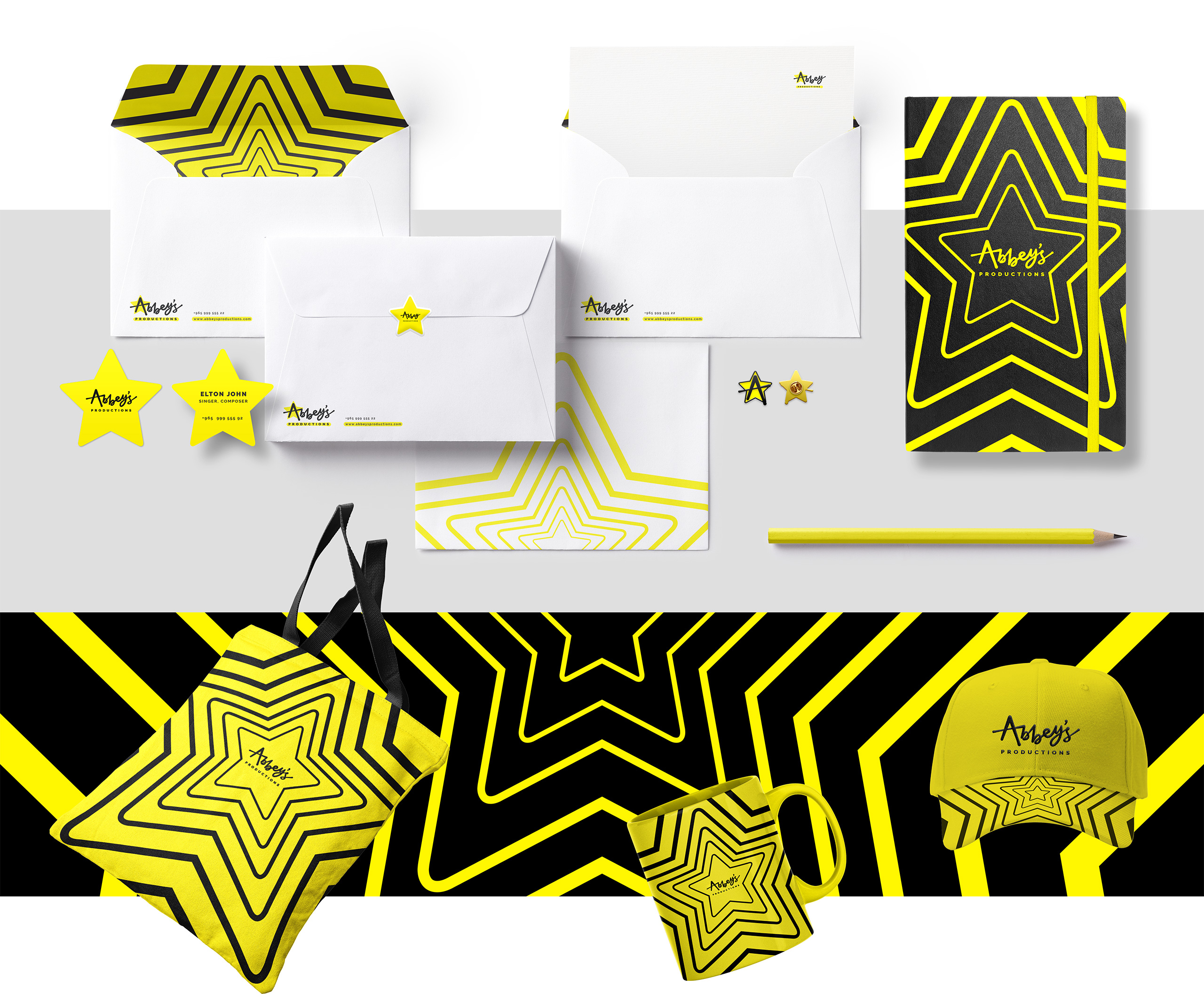
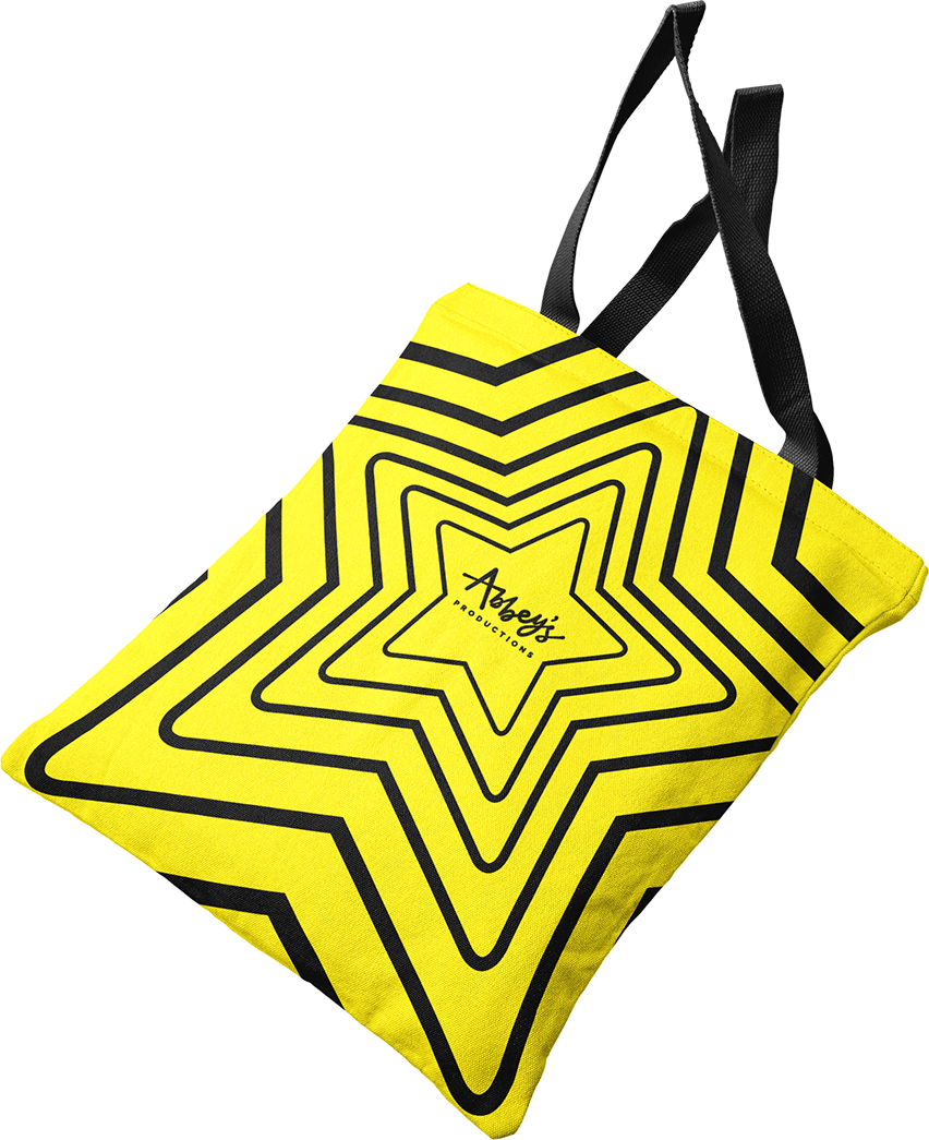
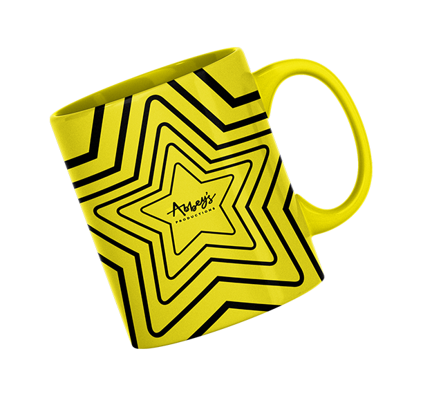
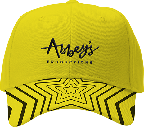
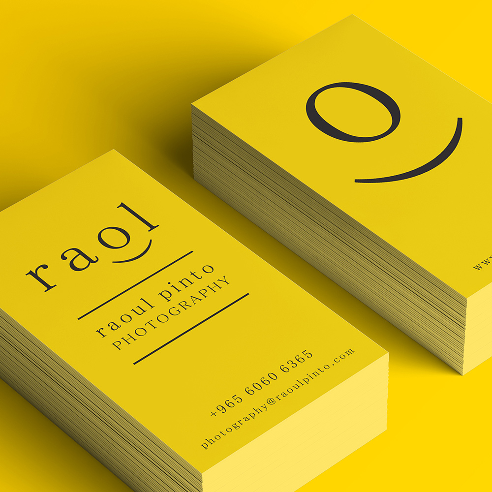
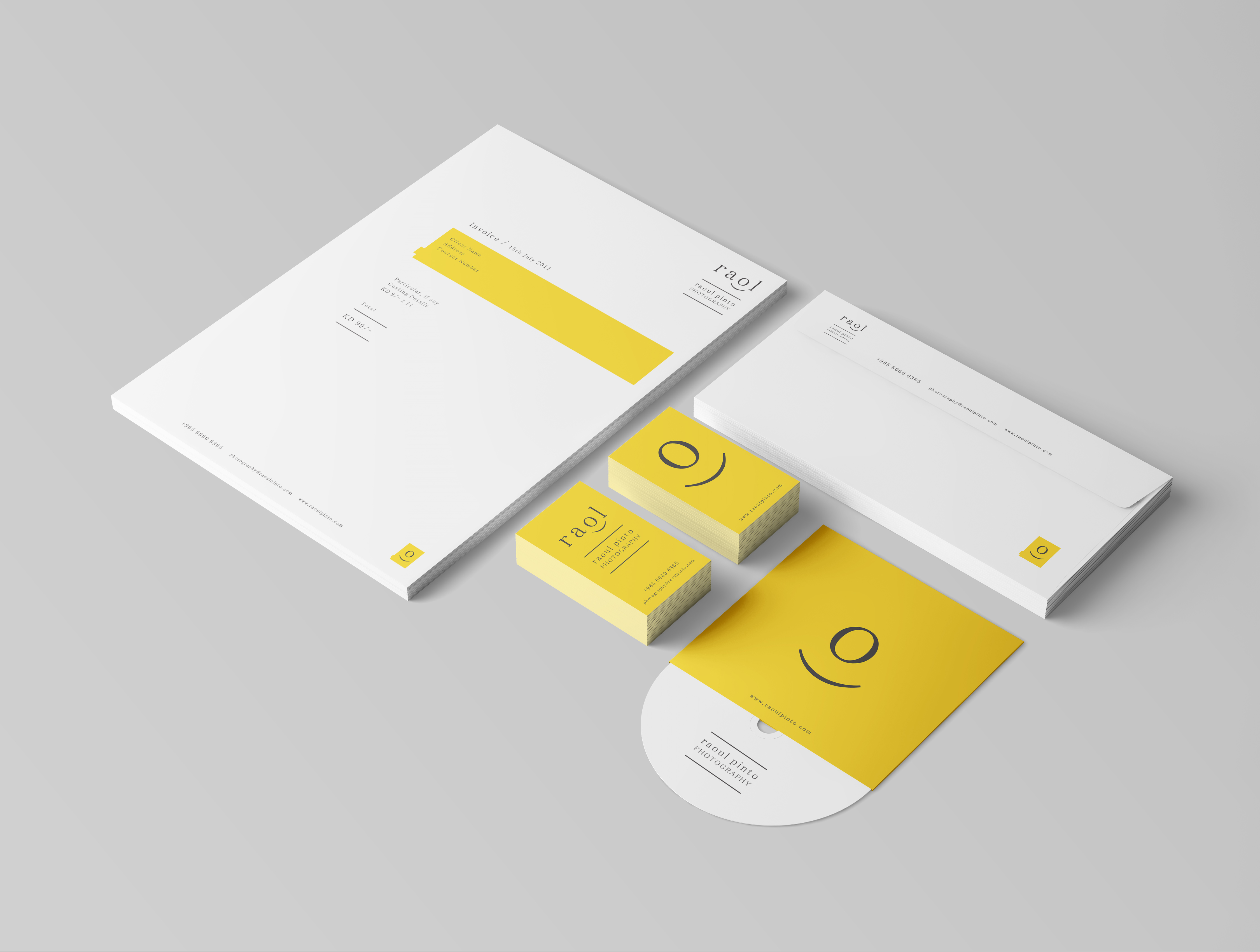
Stationery Design

The not-so-talkative Bow and her friend, the curious cat How