Dawat is one of Kuwait’s oldest, most popular restaurants serving Indian cuisine. With rising competition and a change in customers’ taste, a new direction was needed.
A revitalised logo was suggested as the first step forward.
Sadly, the owners changed their minds and decided against altering the brand’s known identity.
Logo Re-design (Pitch)
Custom Font Design

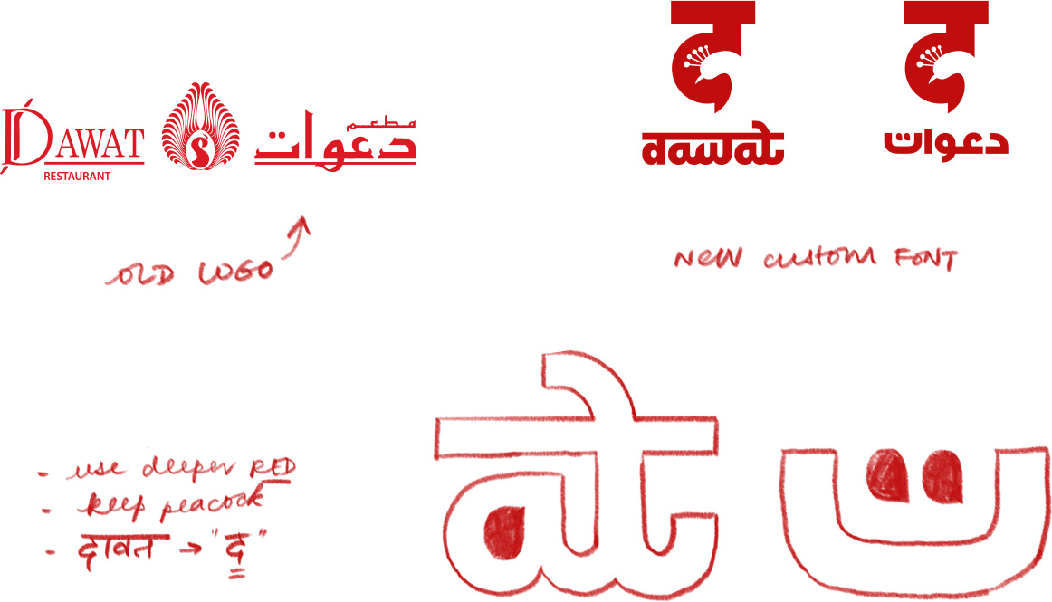
The “द” with a peacock (a symbol carried from the existing logo to maintain an element of continuity) in the negative space immediately creates an association with India.
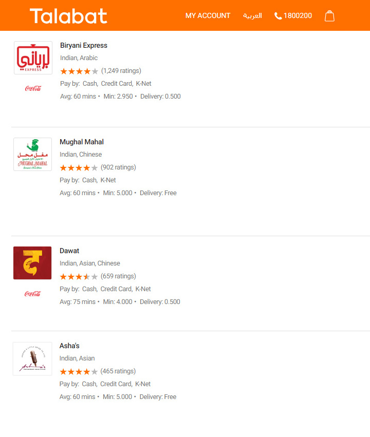
This is solidified by using rich Hindustani colours that remind the viewer of delicious food cooked in rich spices (Mirch Red and Haldi Yellow).

The font preserves the Indian feel of the Devanagari script, but is bold and clear, complementing the logo.
Corresponding custom Arabic lettering fits in harmoniously.


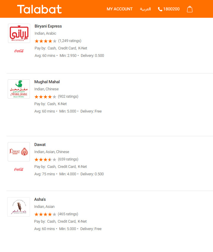
The new logo clearly stands out and stands strong, not only in comparison to the previous one but distinctly among competitors as well.


